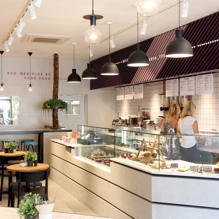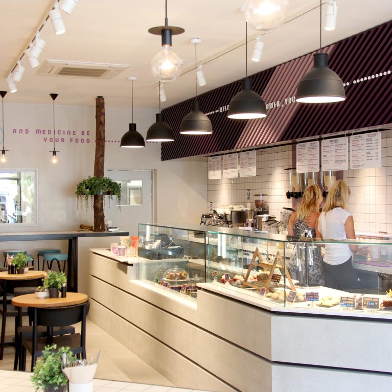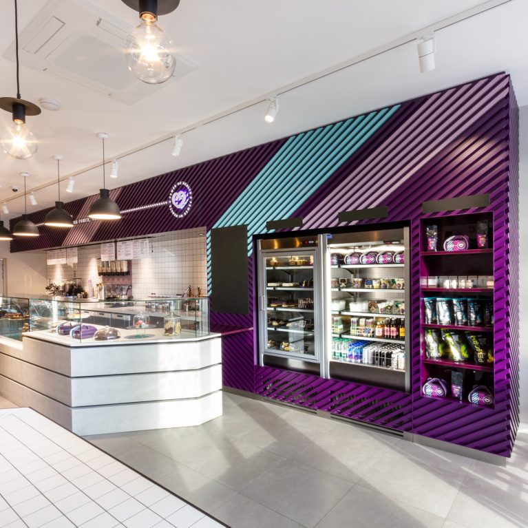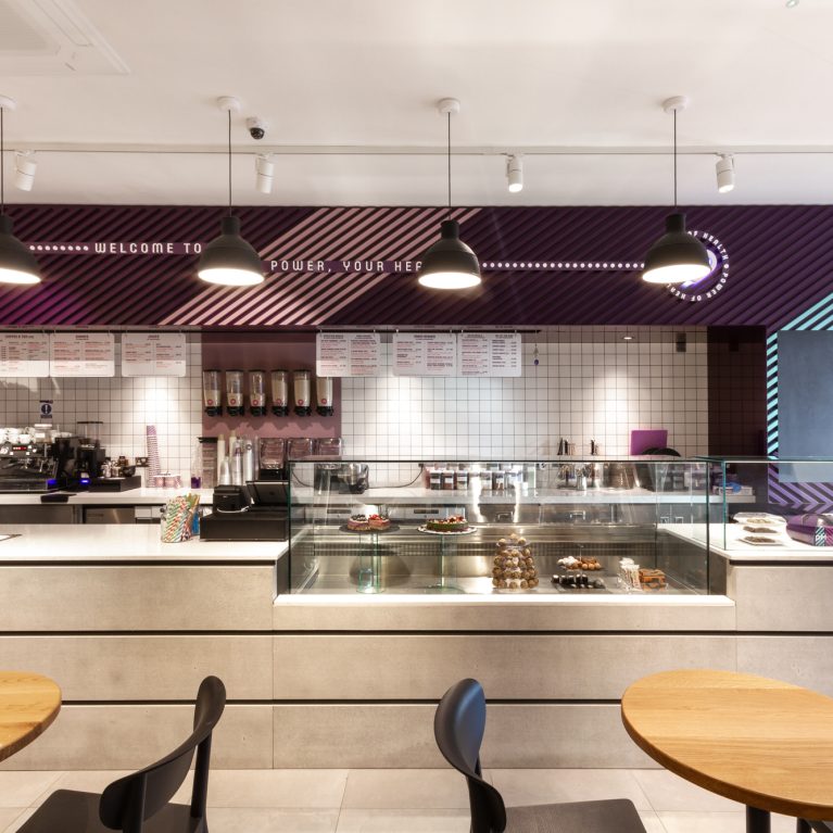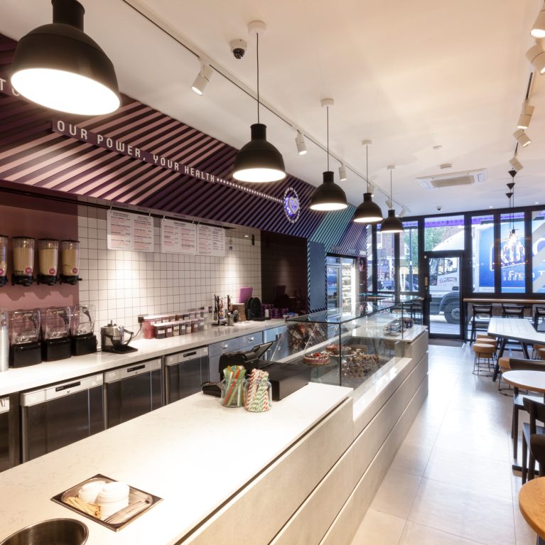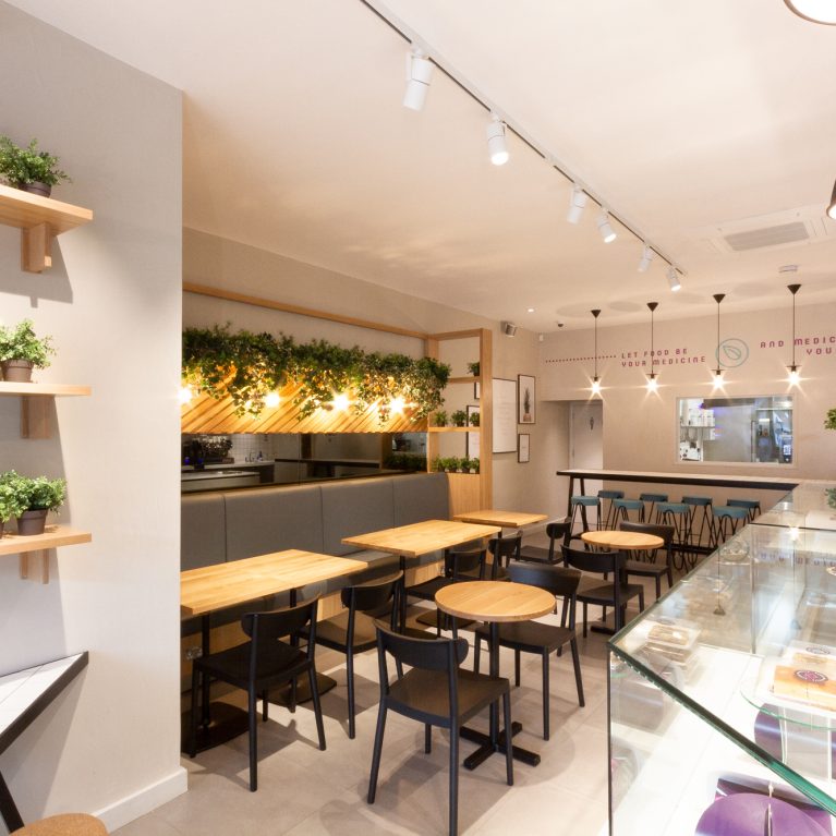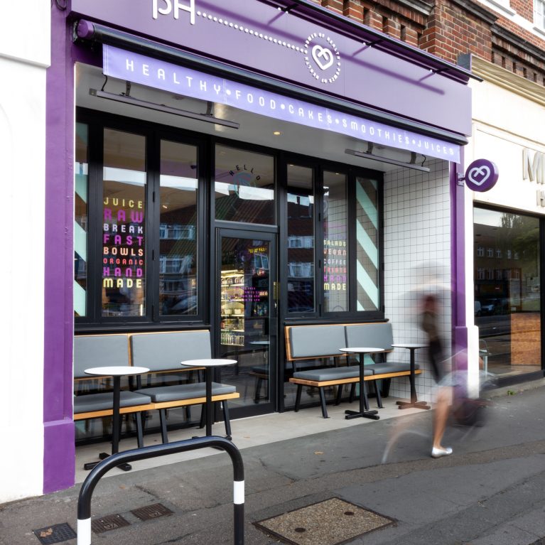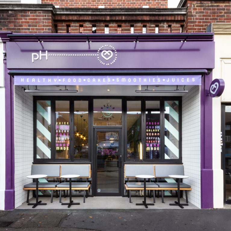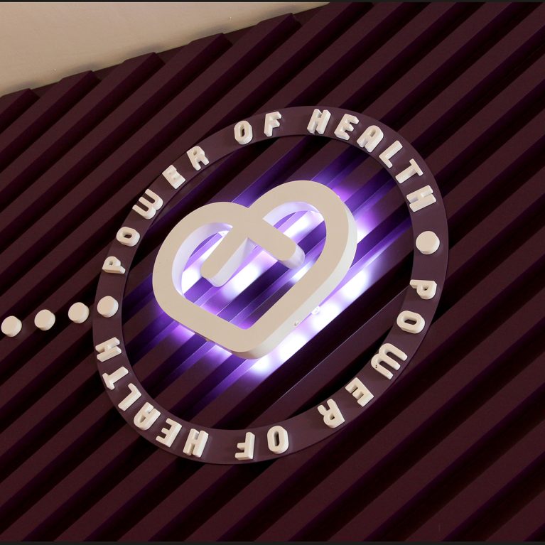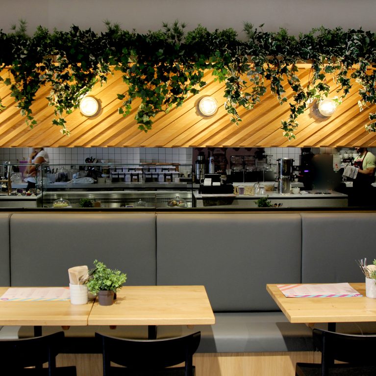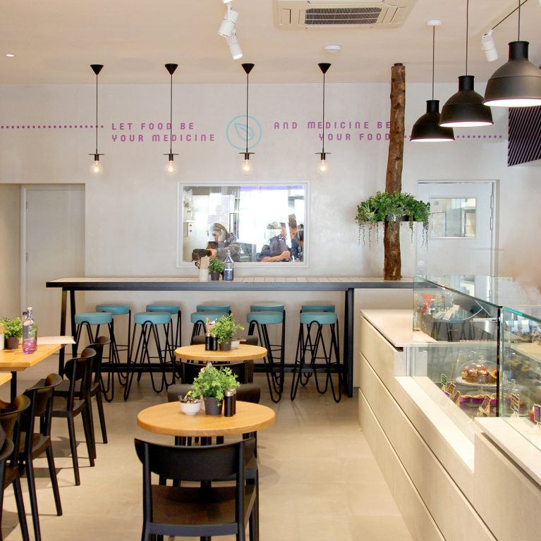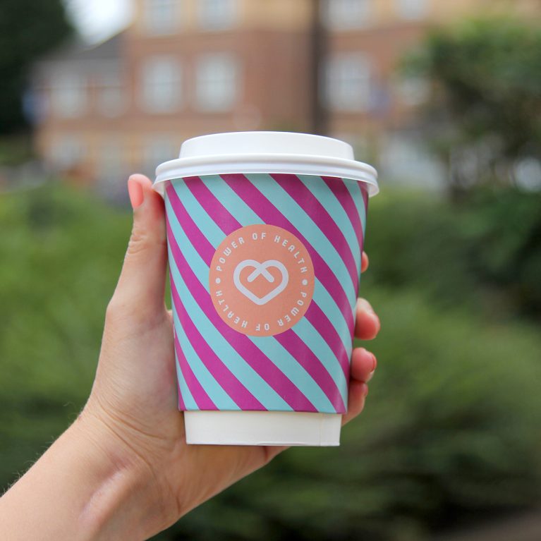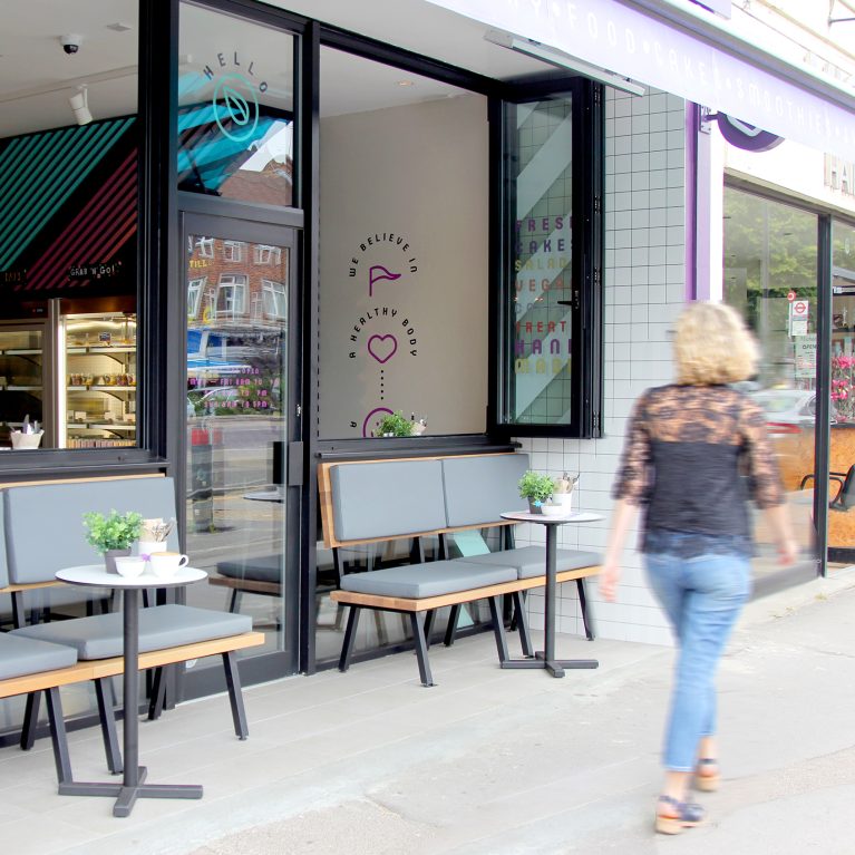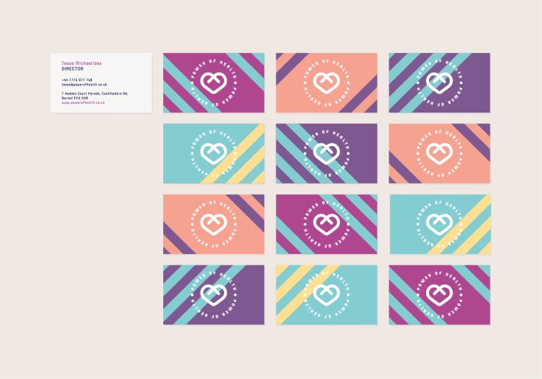
A modular stationery system uses shifting color combinations to showcase the dynamic, energetic nature of the health brand. By spreading the core visual elements across a matrix of different backdrops, the design keeps the identity fresh and highly engaging. This flexible print strategy directly mirrors the layered, multi-toned architectural surfaces found within the cafe space.
The layout displays twelve business cards arranged in a precise grid, each featuring a white circular logo mark stamped over a unique combination of corporate colors. The cards utilize the signature 45-degree diagonal stripes in magenta, teal, peach, and yellow, creating a strong graphic rhythm that links back to the prominent timber slat feature walls. This clever color rotation turns standard corporate stationery into a collectible, lifestyle-oriented brand touchpoint.
To balance the vibrant, high-energy patterns, the reverse side of the card uses a clean layout with minimalist sans-serif typography set against a solid white background. This deliberate layout ensures that key contact details and location info remain exceptionally clear and easy to read. The integration of bold geometric artwork with functional, structured text delivers a polished, sophisticated identity package that extends the cafe's design philosophy into the palm of a hand.