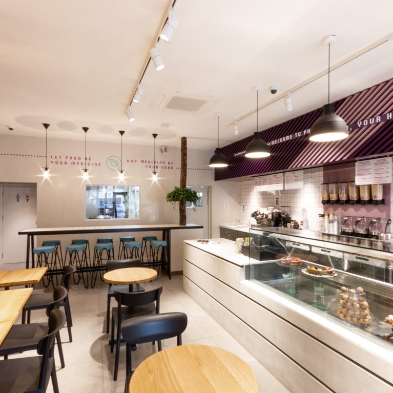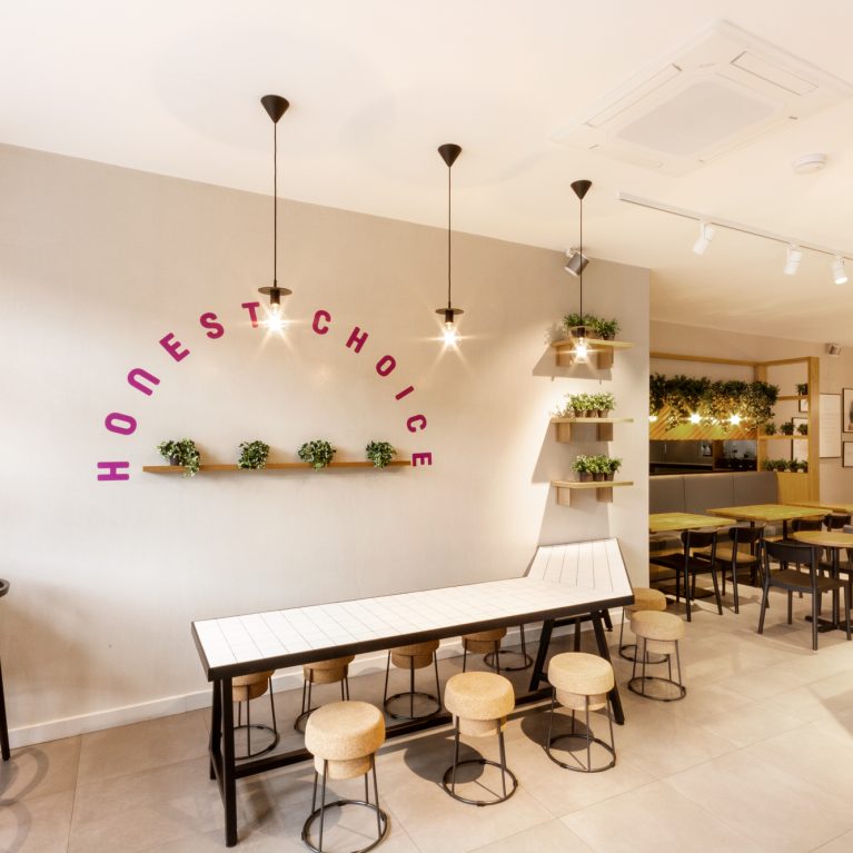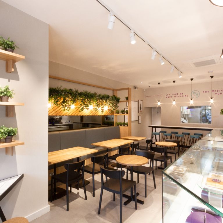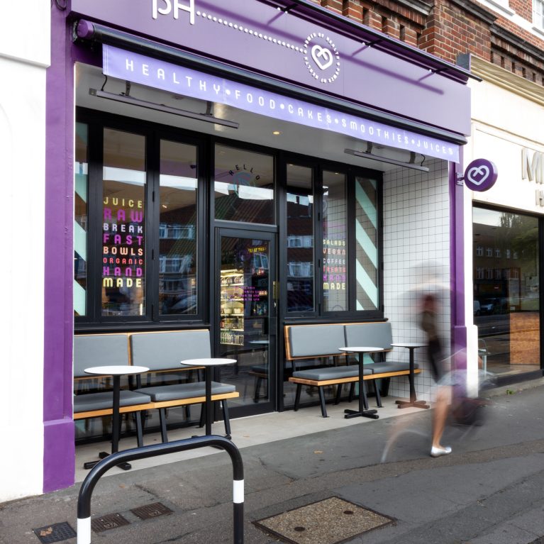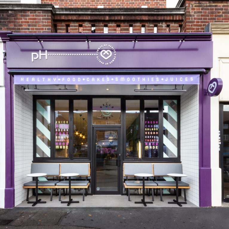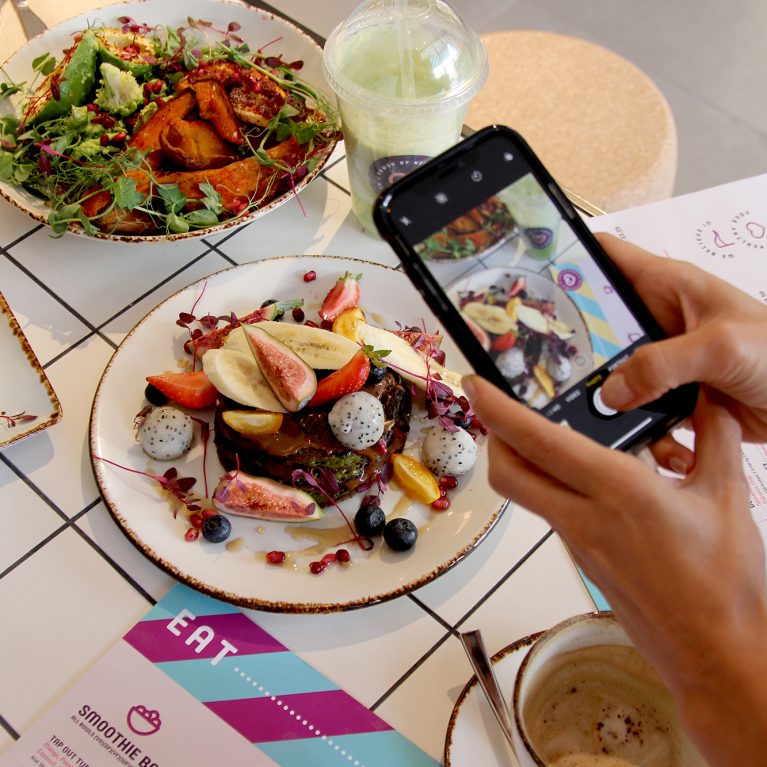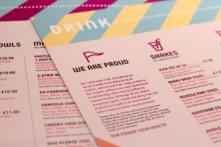
The print collateral acts as a vital typographic layer that reinforces the cafe's health-focused philosophy directly at the dining table. By using clear graphic icons and a structured layout, the menus make complex nutritional choices easy for customers to navigate. This system bridges the gap between digital brand identity and physical hospitality.
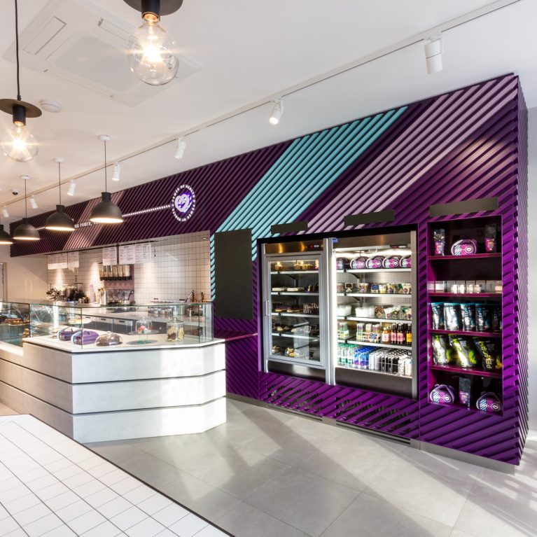
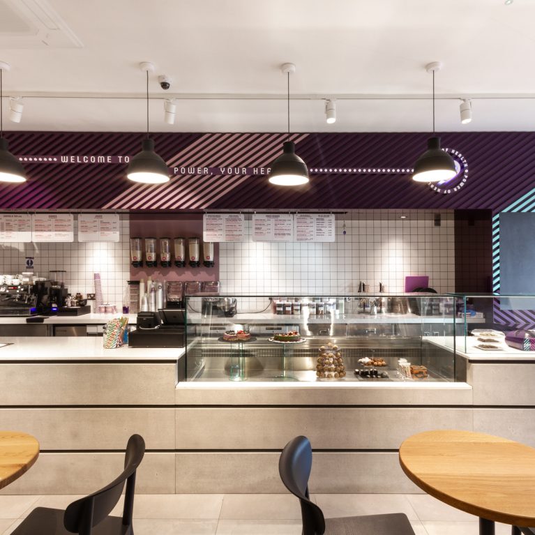
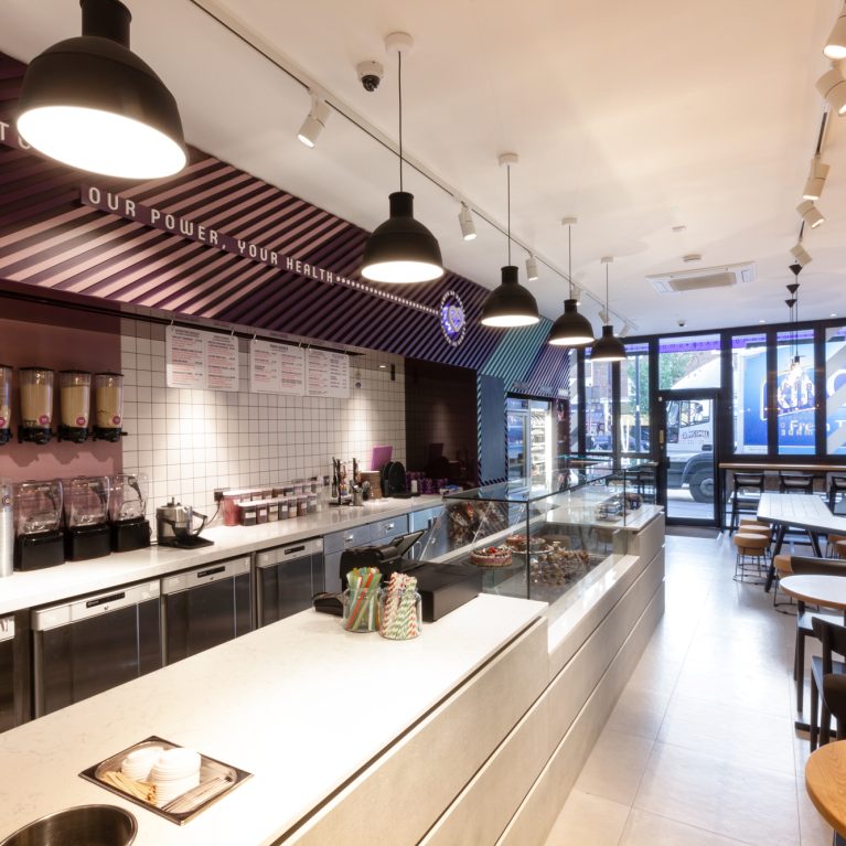
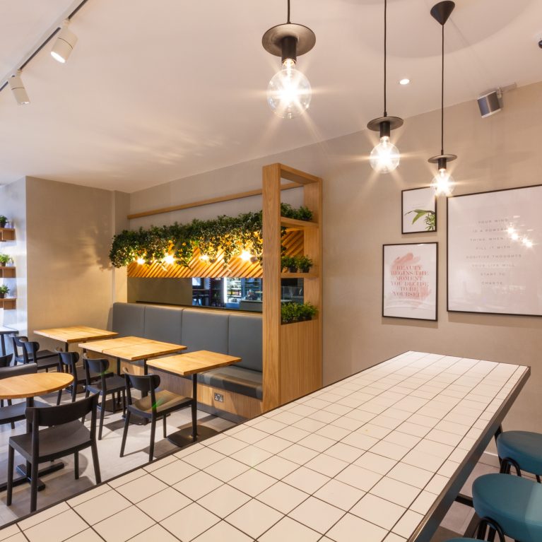
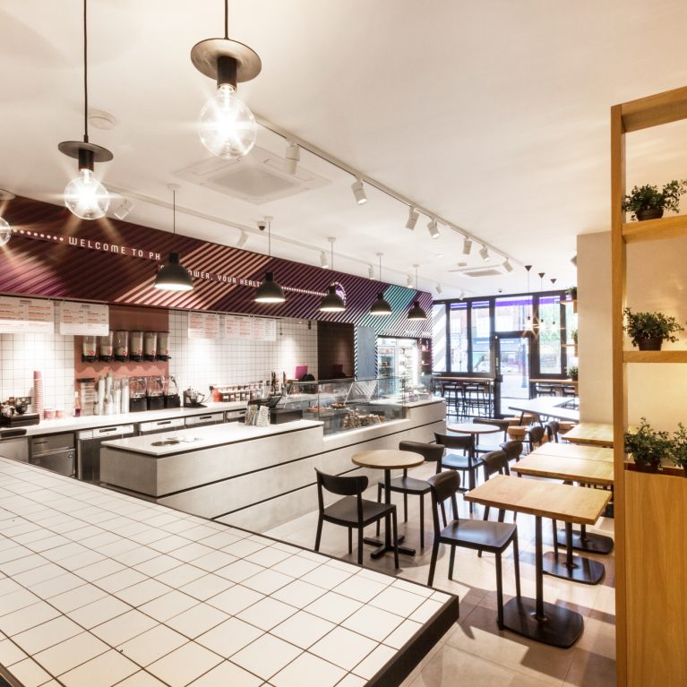
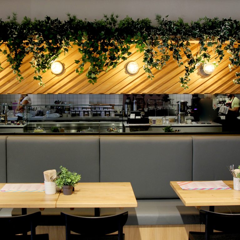
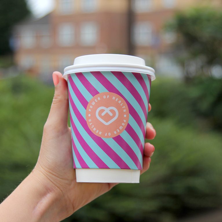
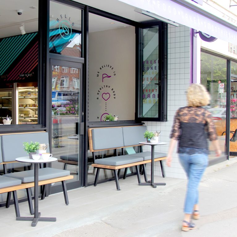
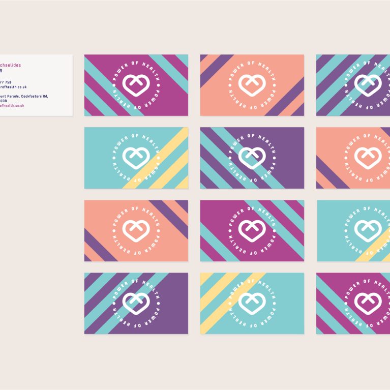
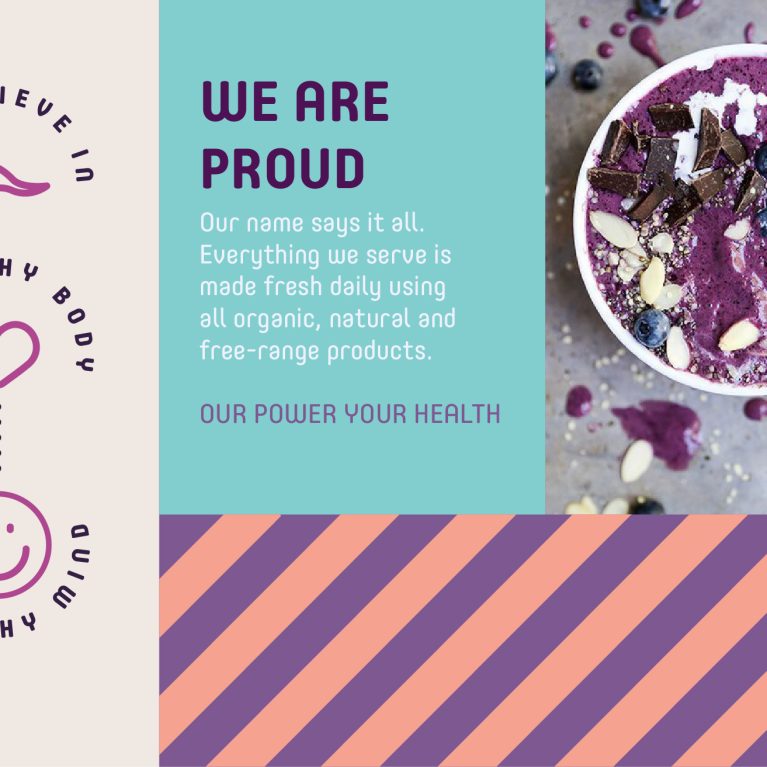
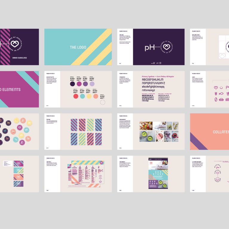
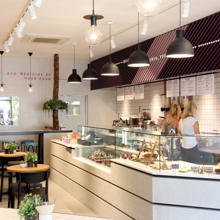
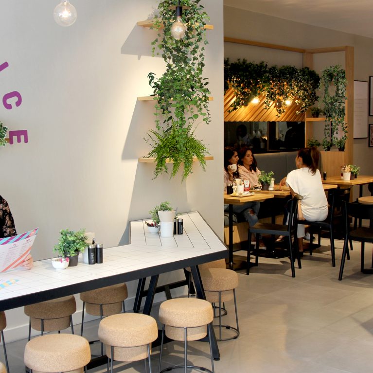
The menu cards feature a clean grid layout printed on high-weight matte paper, matching the smooth surfaces of the light oak timber tables. The header section introduces a playful, multi-colored diagonal pattern using the brand's signature teal, yellow, and magenta color palette. This striking geometric detail mirrors the vibrant timber slat art installations running down the cafe's main interior walls.
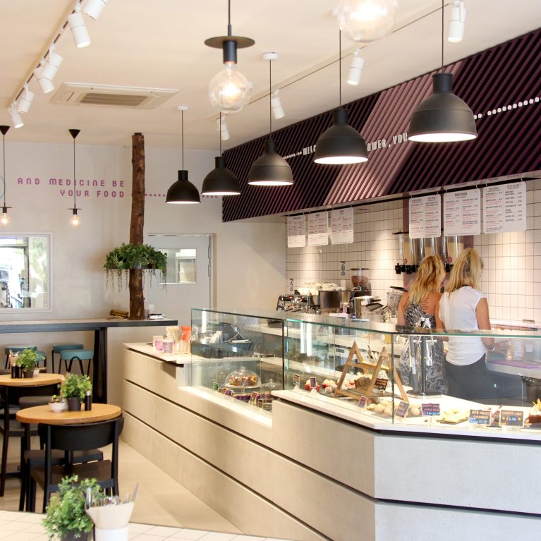
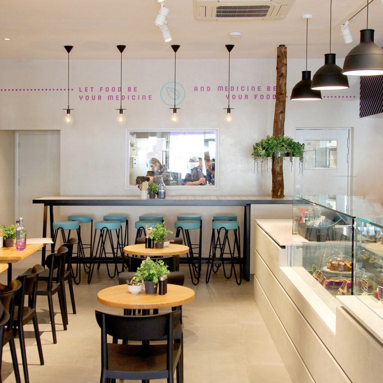
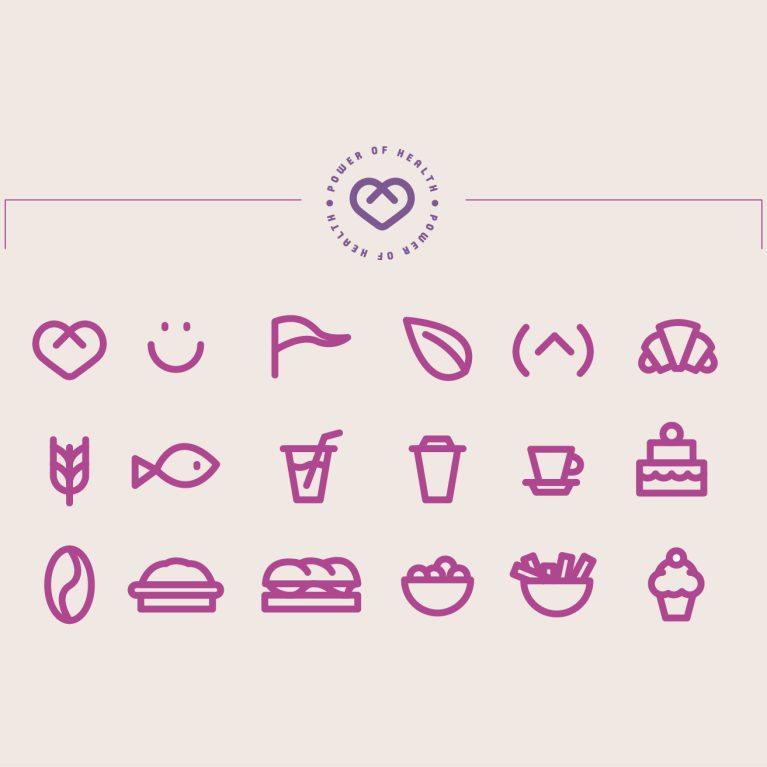
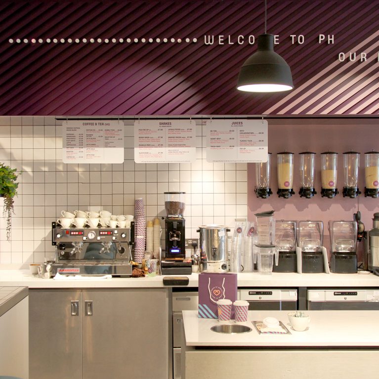
Below the header, minimalist line icons define the separate food and beverage categories, keeping the customer ordering process fast and clear. Bold sans-serif typography works alongside soft magenta body text to create a high-contrast reading layout under the warm hanging pendant lights. This careful coordination of color systems and layout design turns a standard menu into a polished extension of the space.