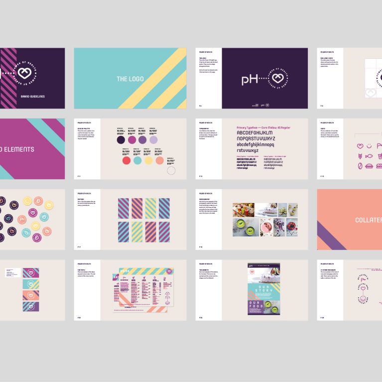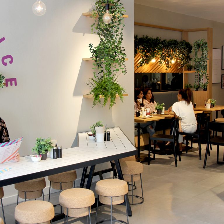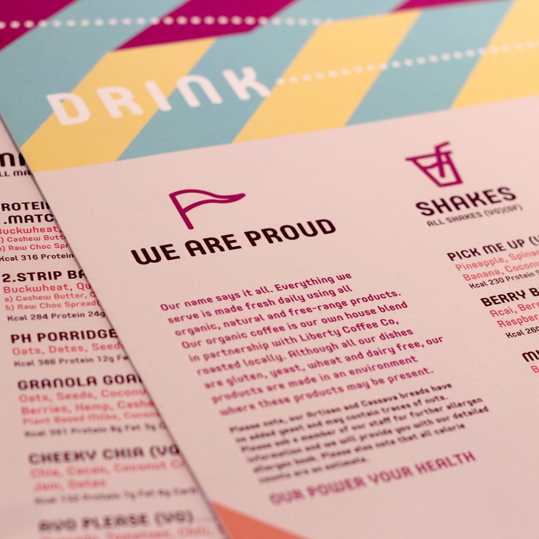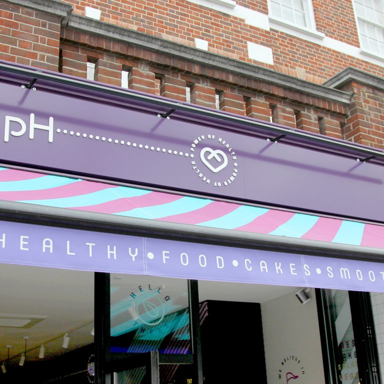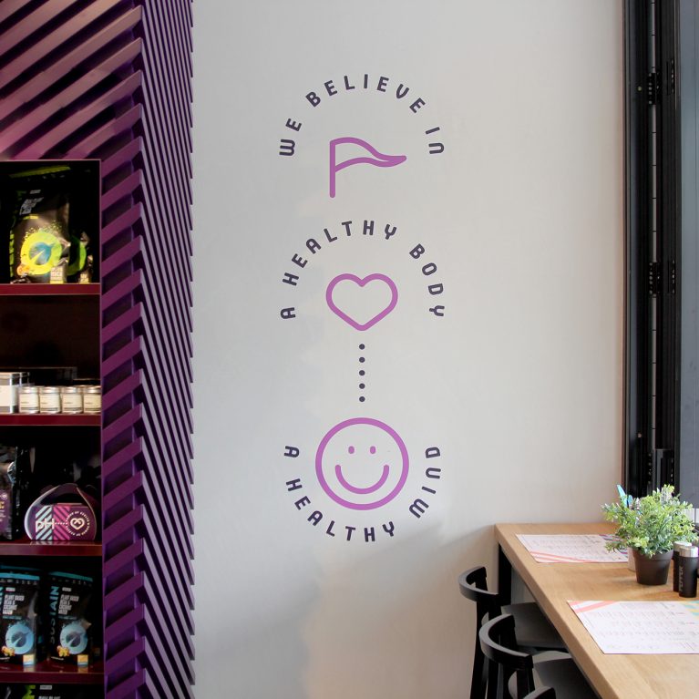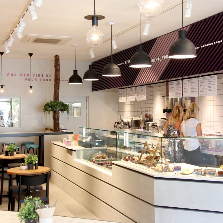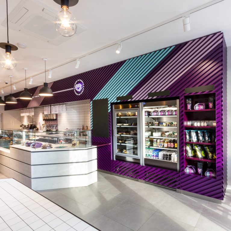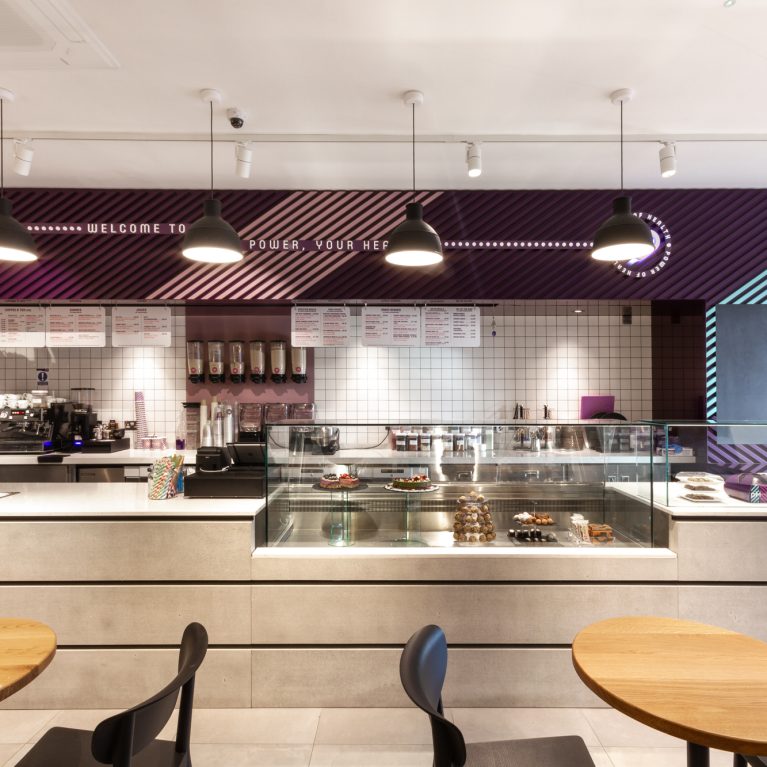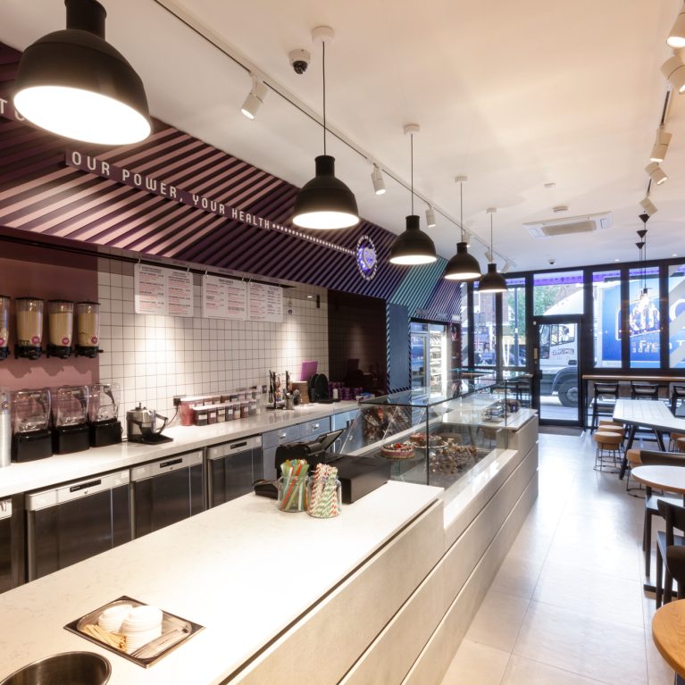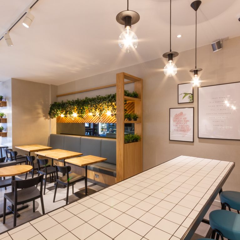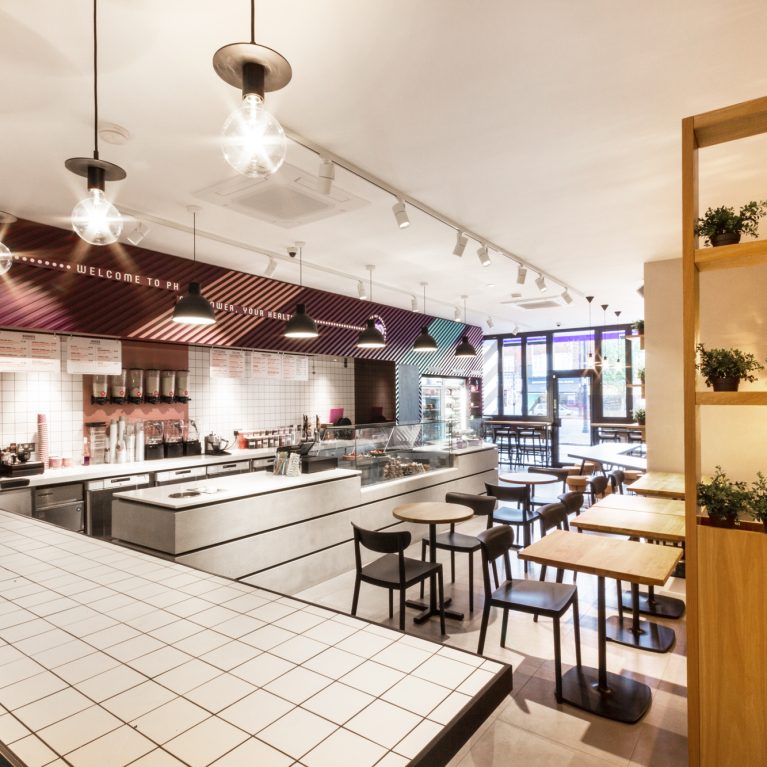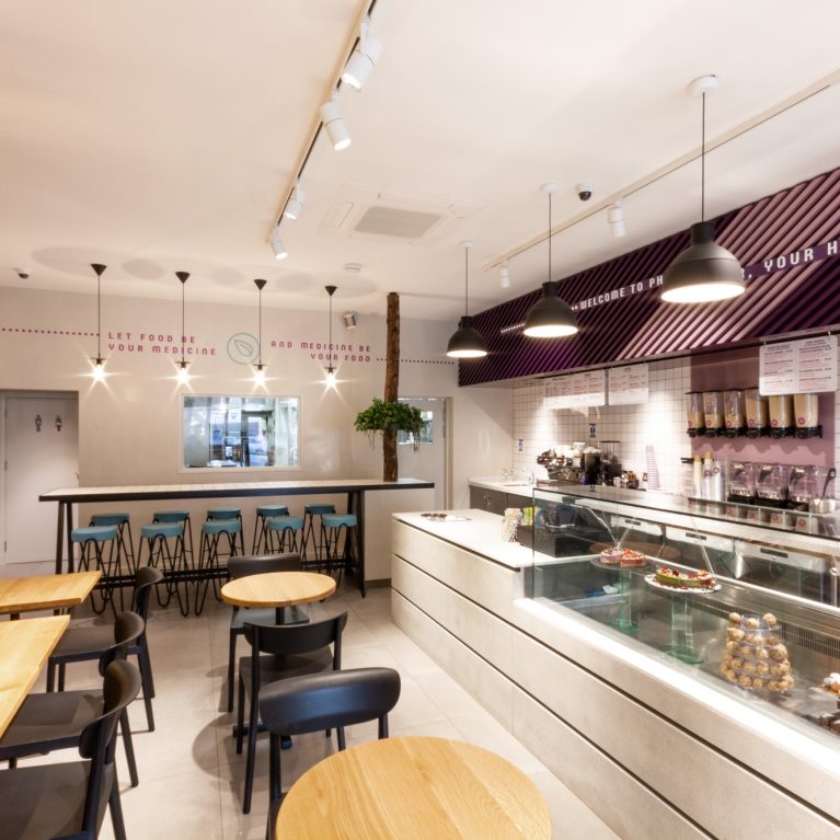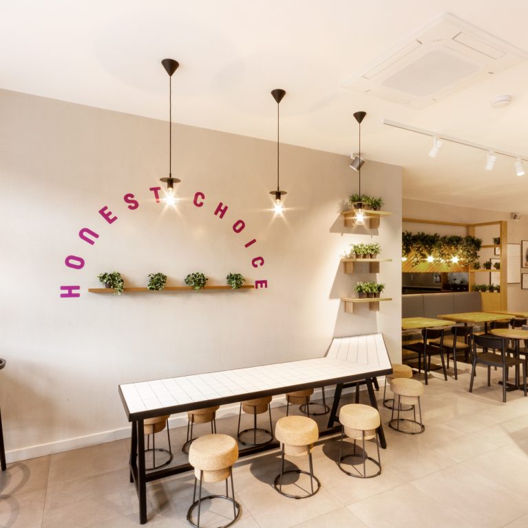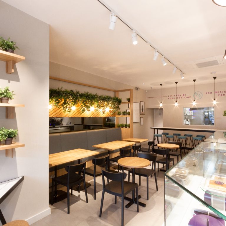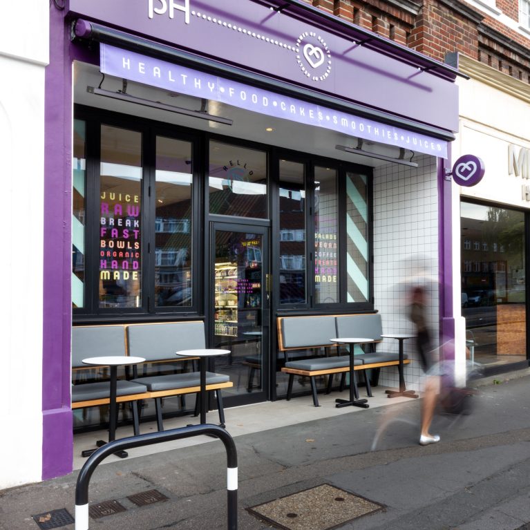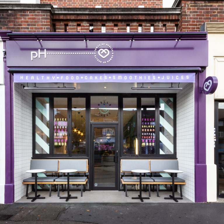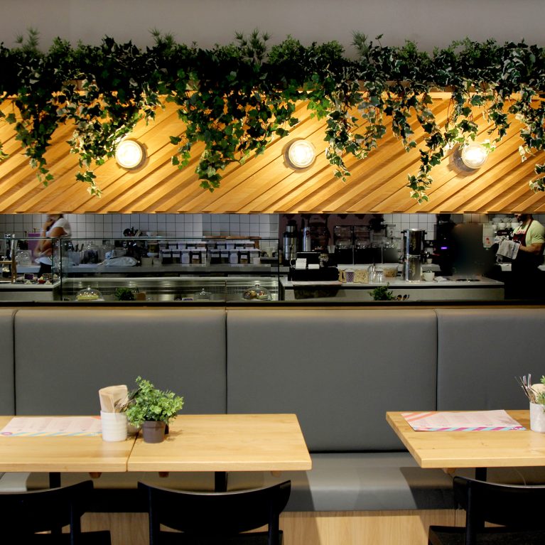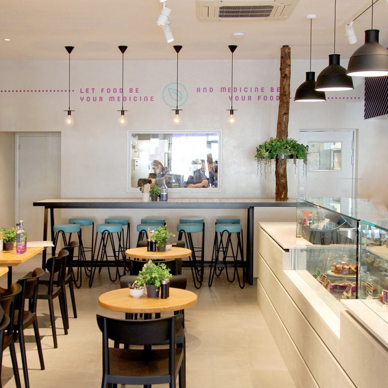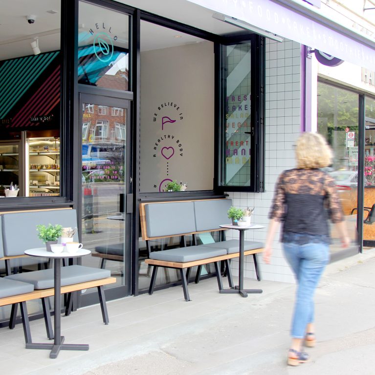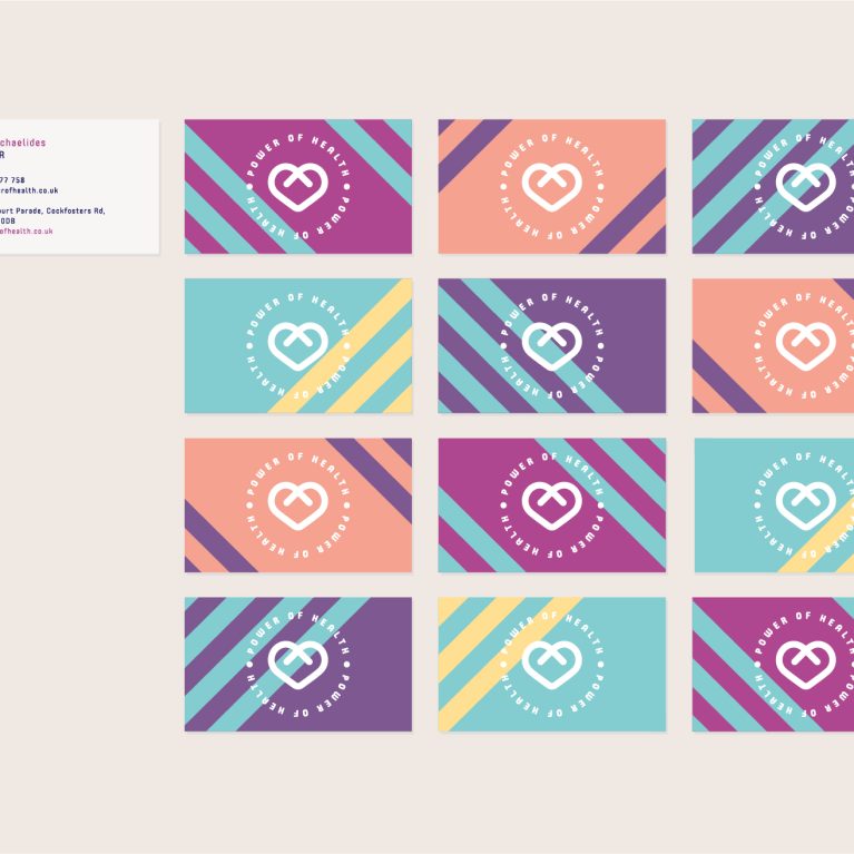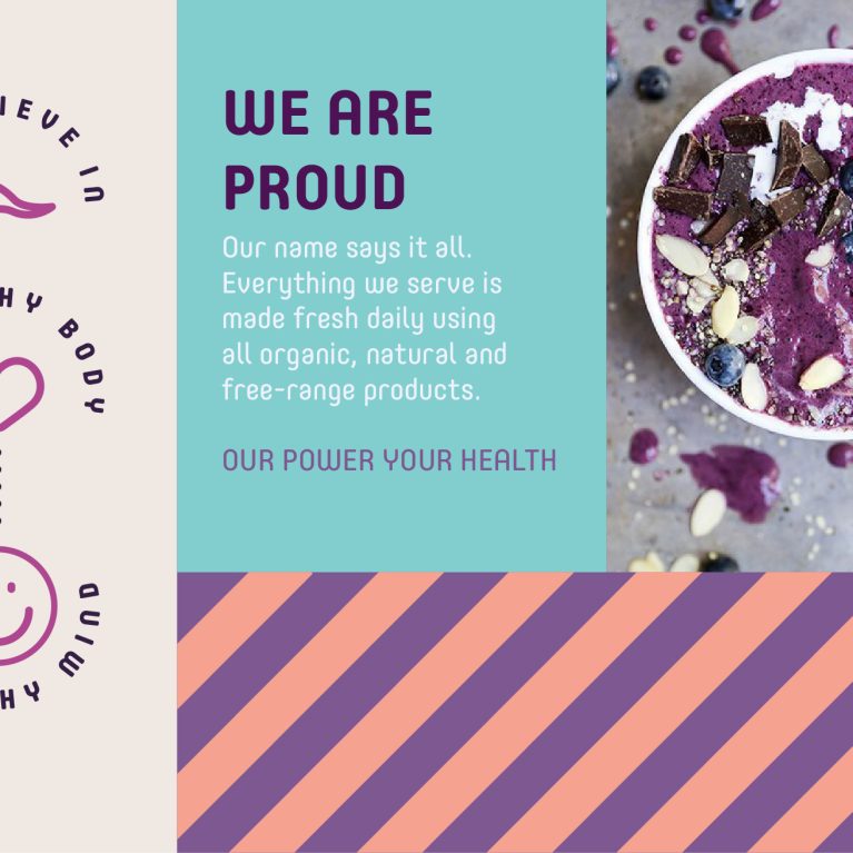
A unified pictographic language replaces text-heavy menus with intuitive, universally accessible visual markers. By styling raw dietary categories into a structured icon matrix, the design accelerates customer decision-making at active ordering points. This graphic tool anchors the physical store environment and print collateral to simplify the guest journey.
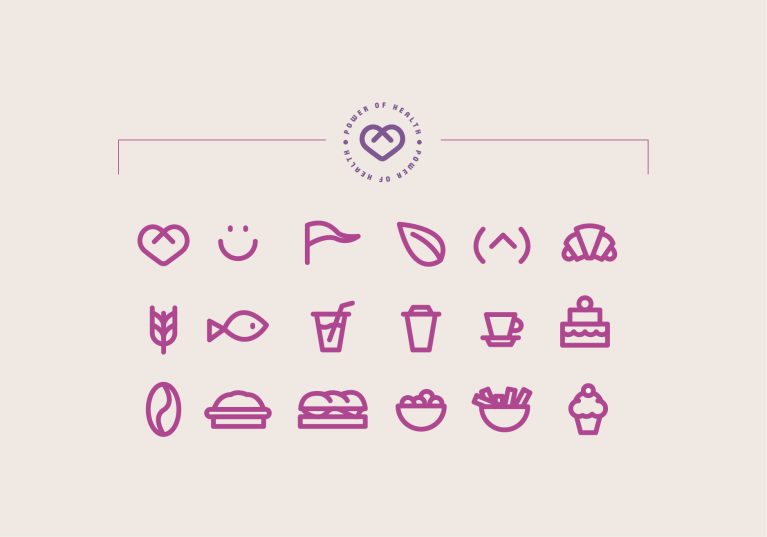
The graphic system features eighteen custom line icons rendered in a consistent magenta stroke weight, matching the clean architectural linework of the cafe. The symbols translate menu ingredients—from coffee beans and fresh leaves to bakery items—into minimalist geometric shapes that fit neatly onto small product labels and digital display screens. This uniform styling ensures that complex dietary and allergen information reads clearly without cluttering the counter space.
Anchored at the top, a circular master seal houses the core heart emblem inside fine structural framing lines. The soft, neutral background provides high contrast, allowing the vibrant magenta icons to serve as standalone graphic accents on custom packaging and large-scale interior wall features. This integrated graphic strategy demonstrates how functional retail information can be elevated into an elegant, highly memorable branding asset.