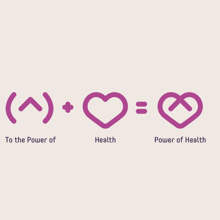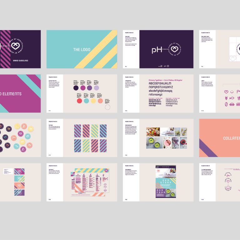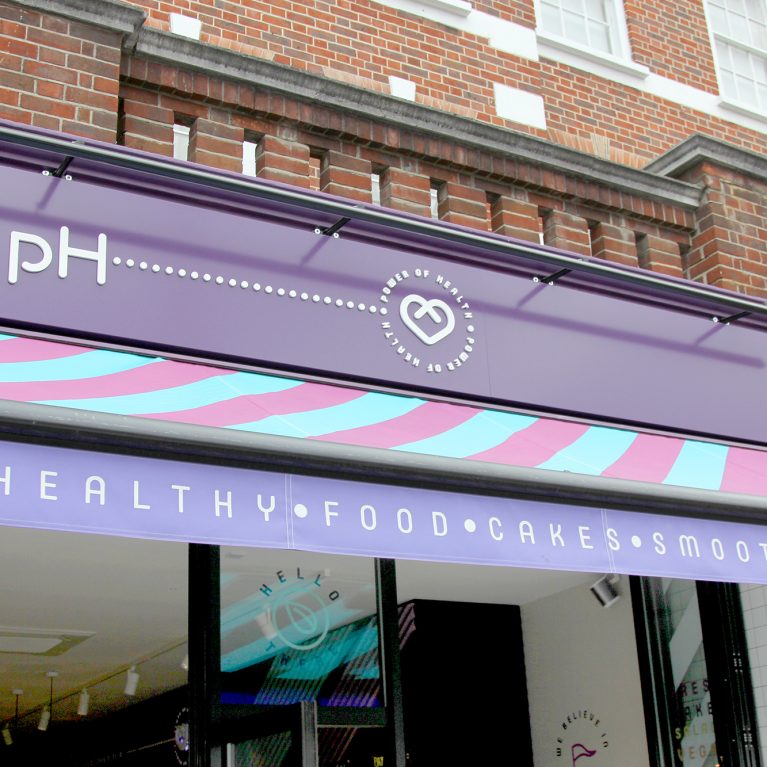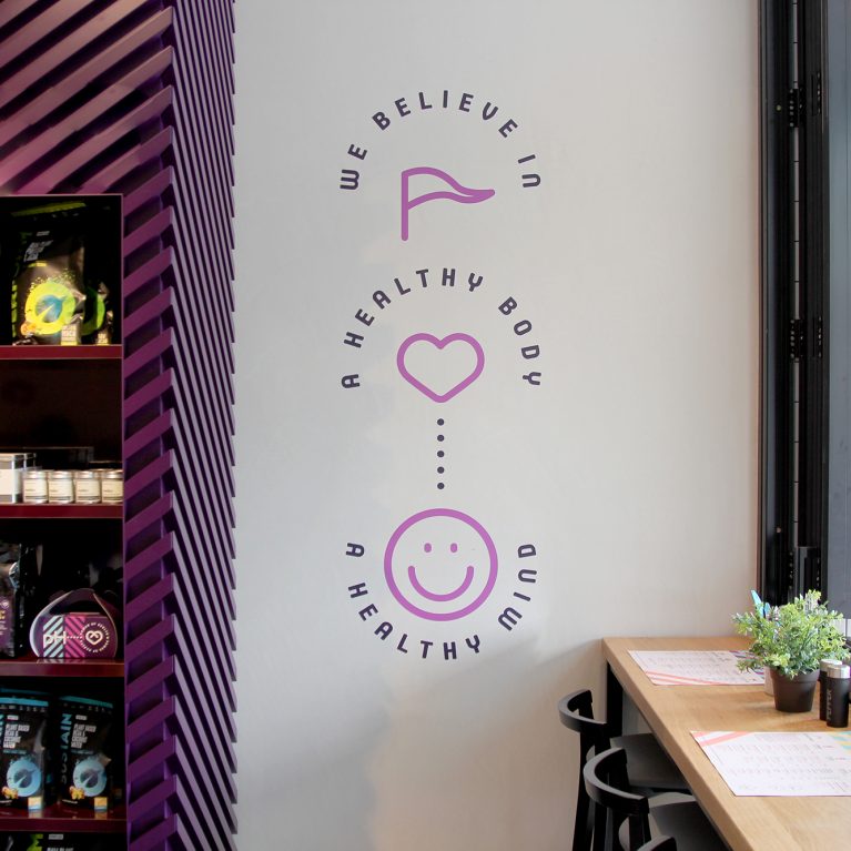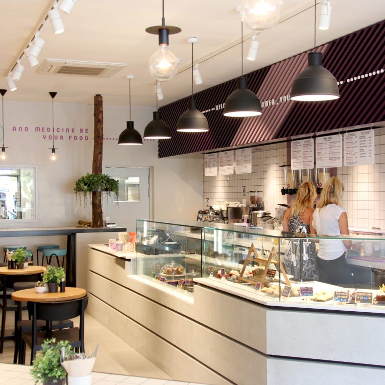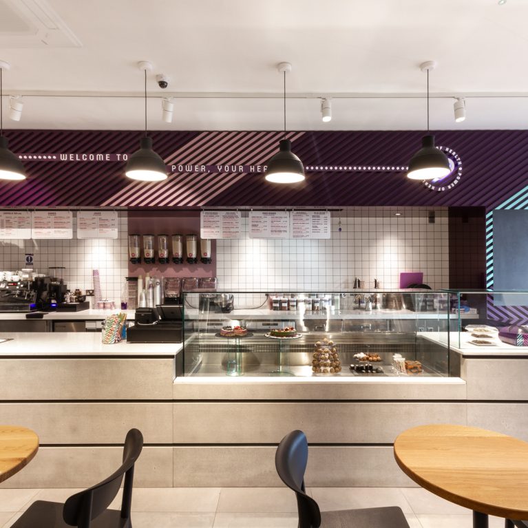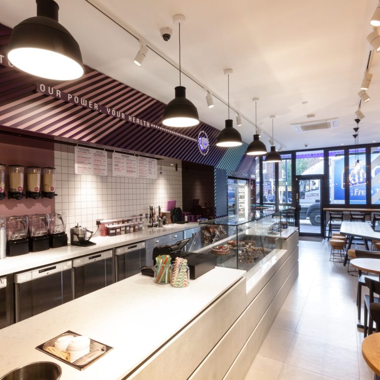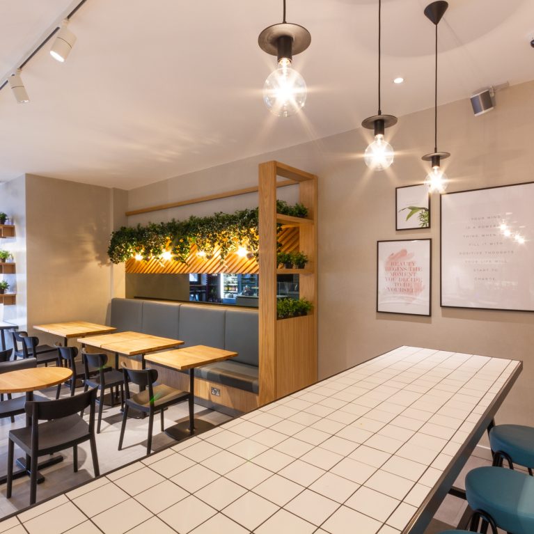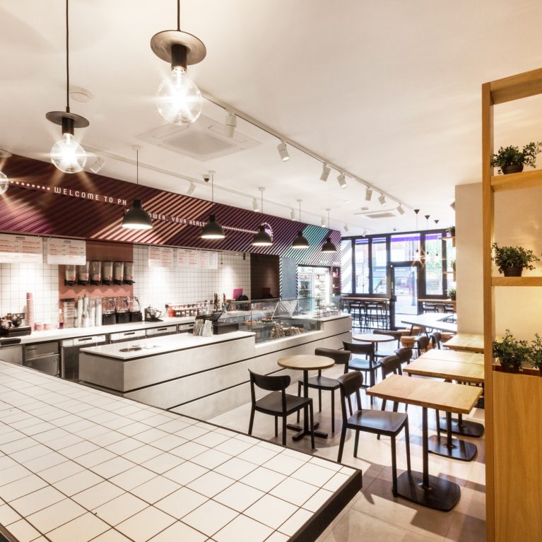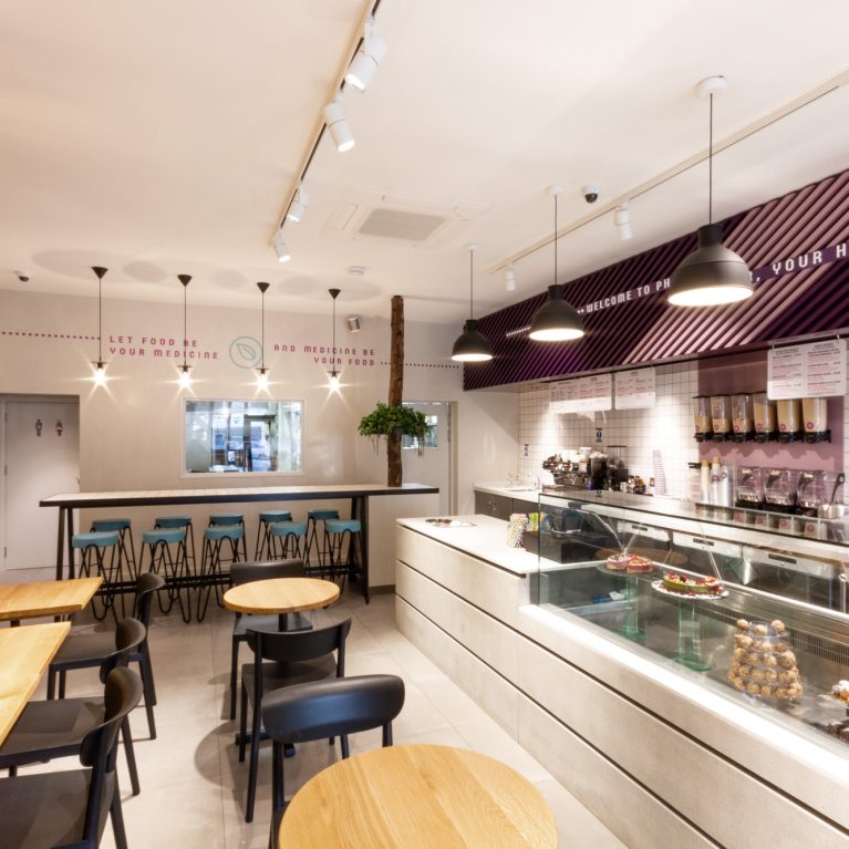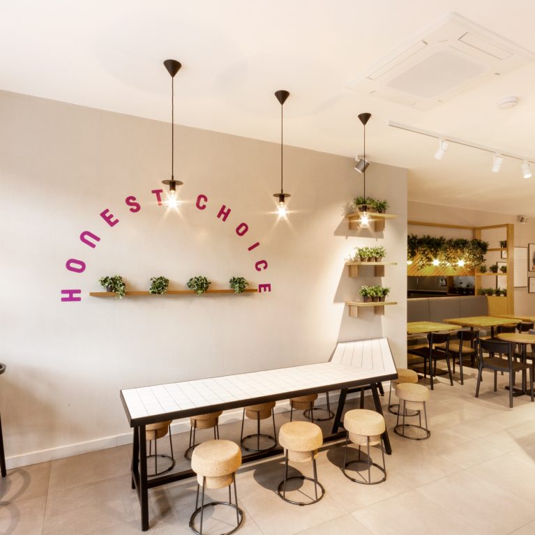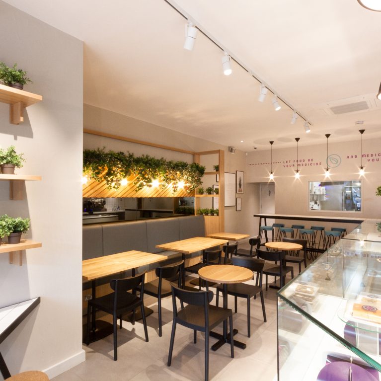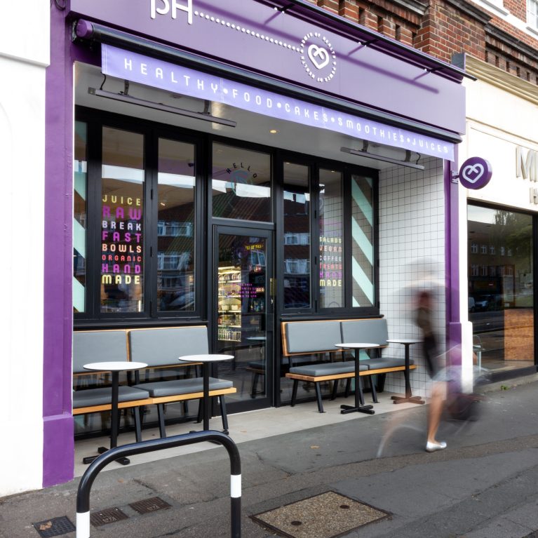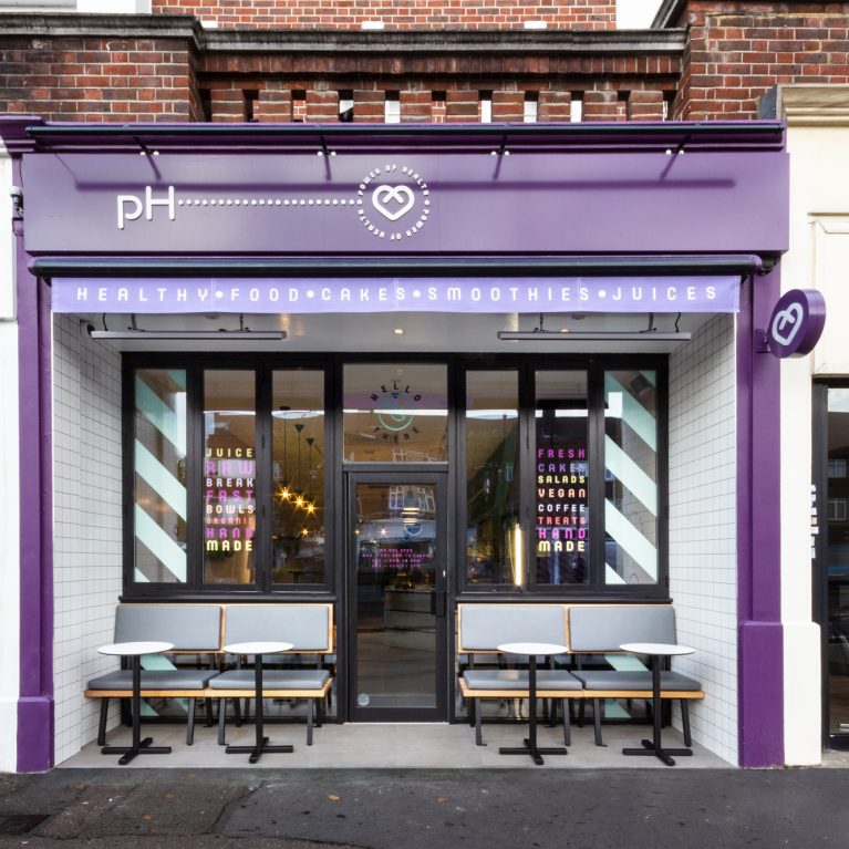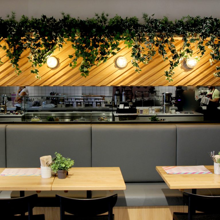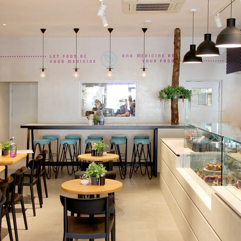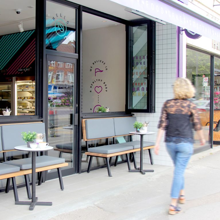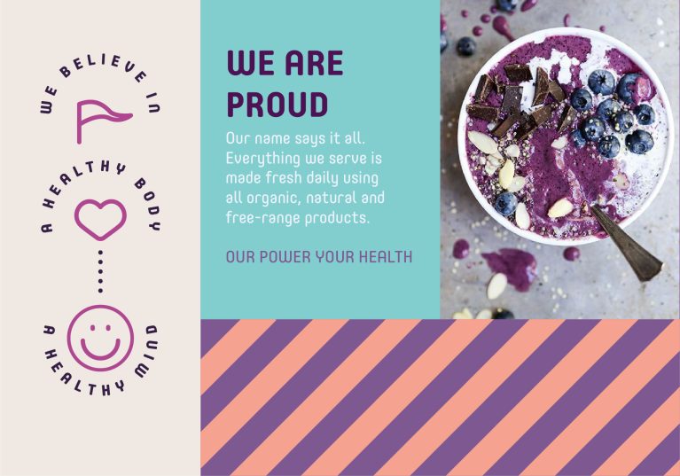
The brand’s graphic system functions as a visual philosophy statement that bridges digital media and physical touchpoints. By organizing corporate values into a structured grid layout, the design instantly communicates a commitment to healthy living. This clear framework forms the baseline for all physical marketing and interior signage.
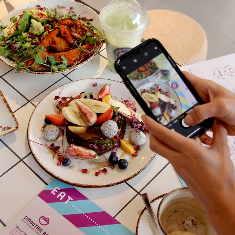
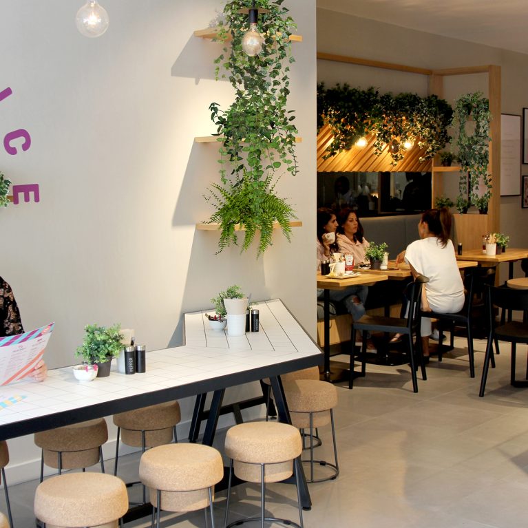
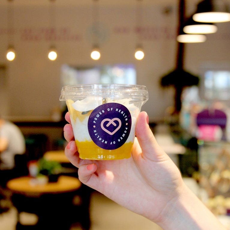
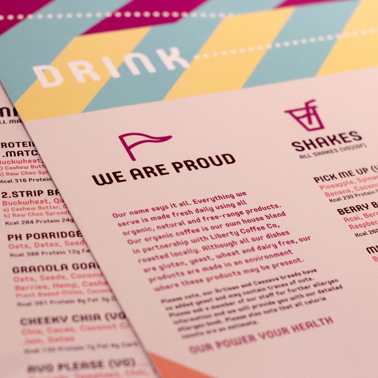
The layout uses a three-panel asymmetric grid that mirrors the geometric timber installations found along the main dining walls. The left panel introduces minimalist circular icons and arched text, adding a modern lifestyle layer that translates perfectly to menu layouts. On the right, high-contrast food photography puts the vibrant colors of fresh ingredients on display, highlighting raw nutrition.
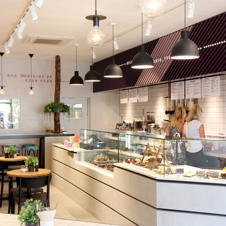
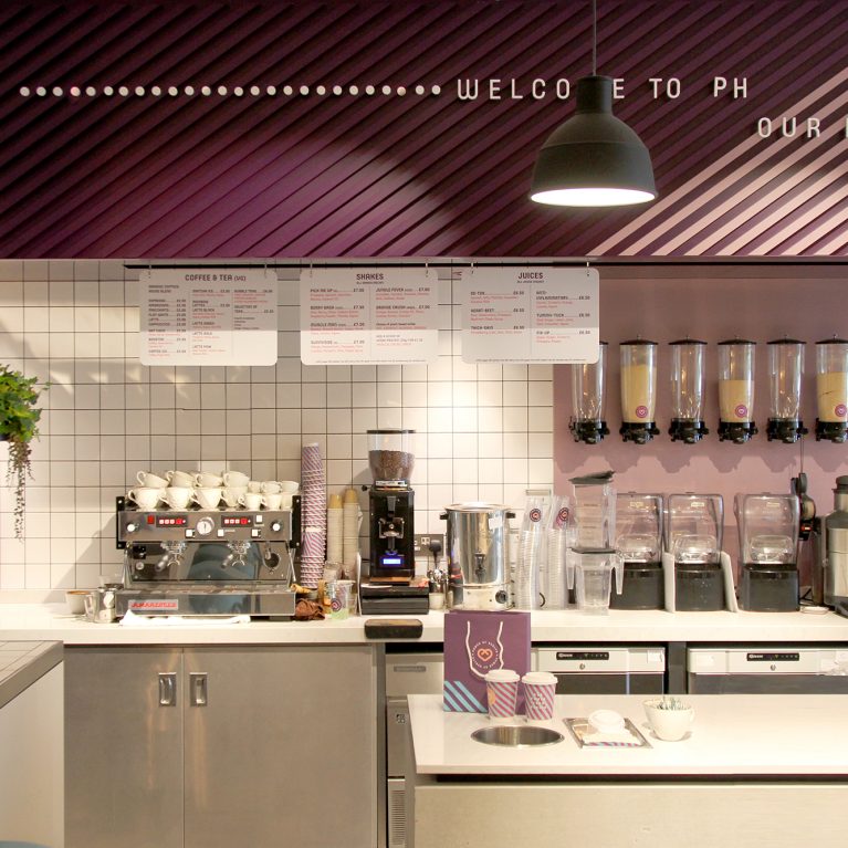
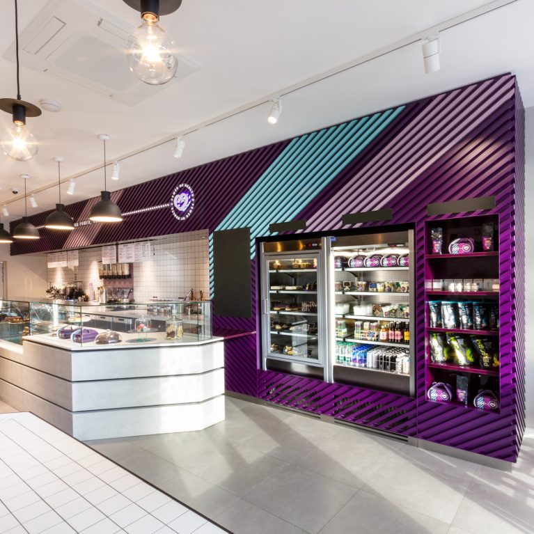
The bottom panel uses a repeating diagonal stripe motif in the brand's signature purple and peach color palette. This energetic graphic pattern directly references the custom architectural slat wall over the main service counter, tying print graphics to the physical space. The mix of bold typography, raw textures, and clear geometry delivers a cohesive, highly polished brand identity.