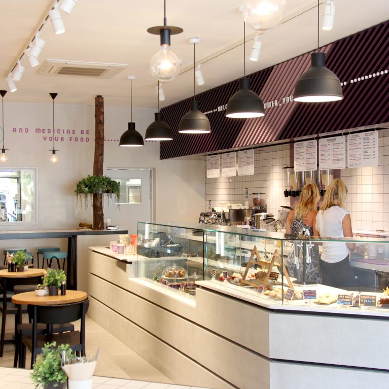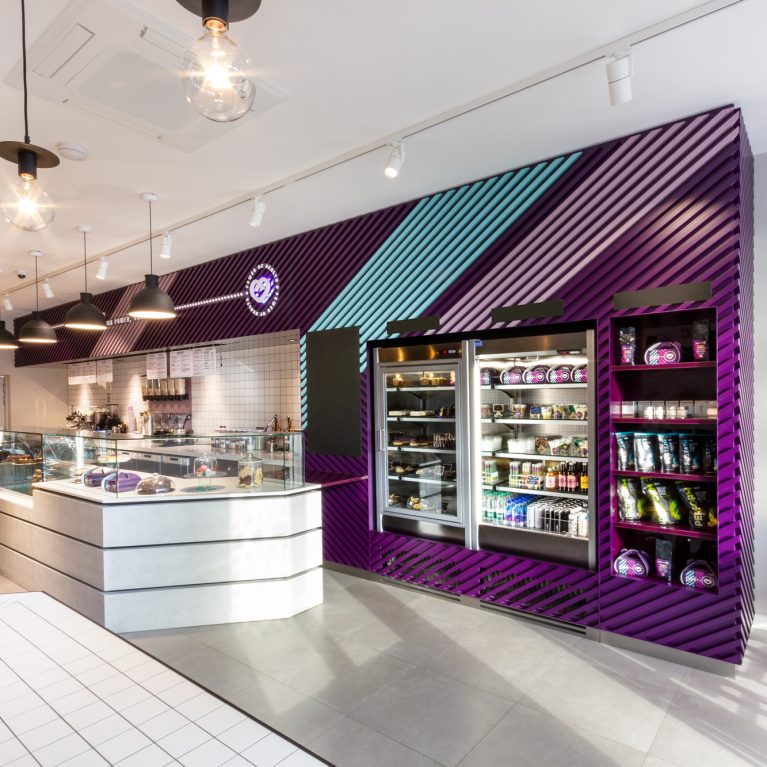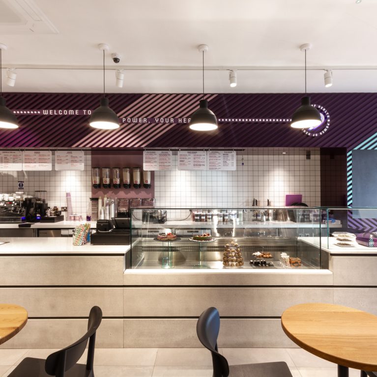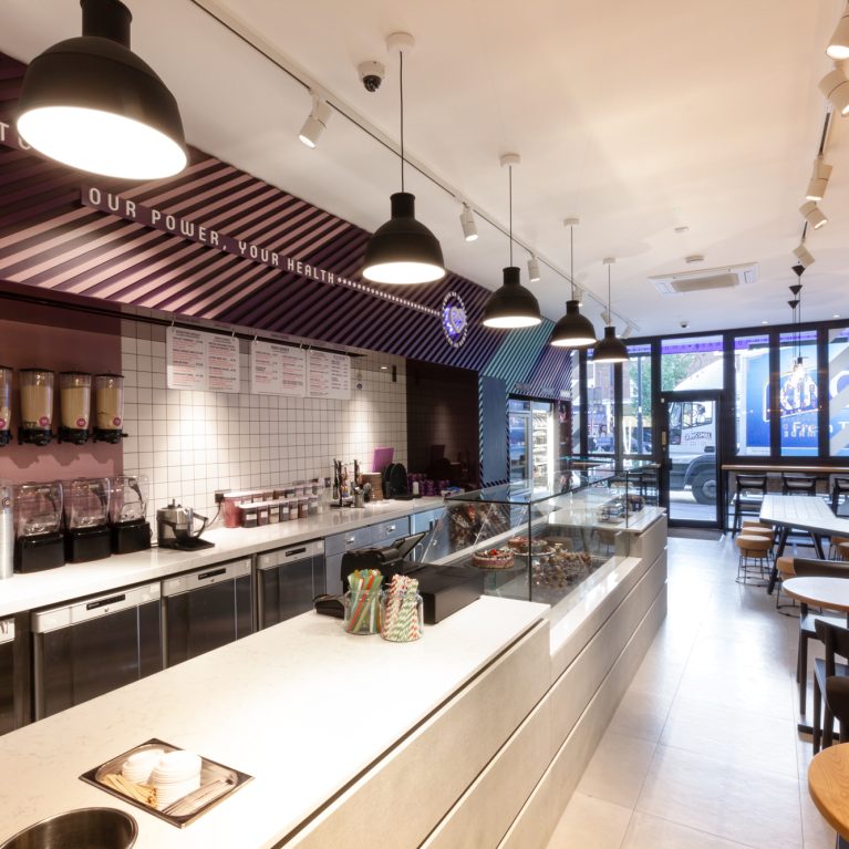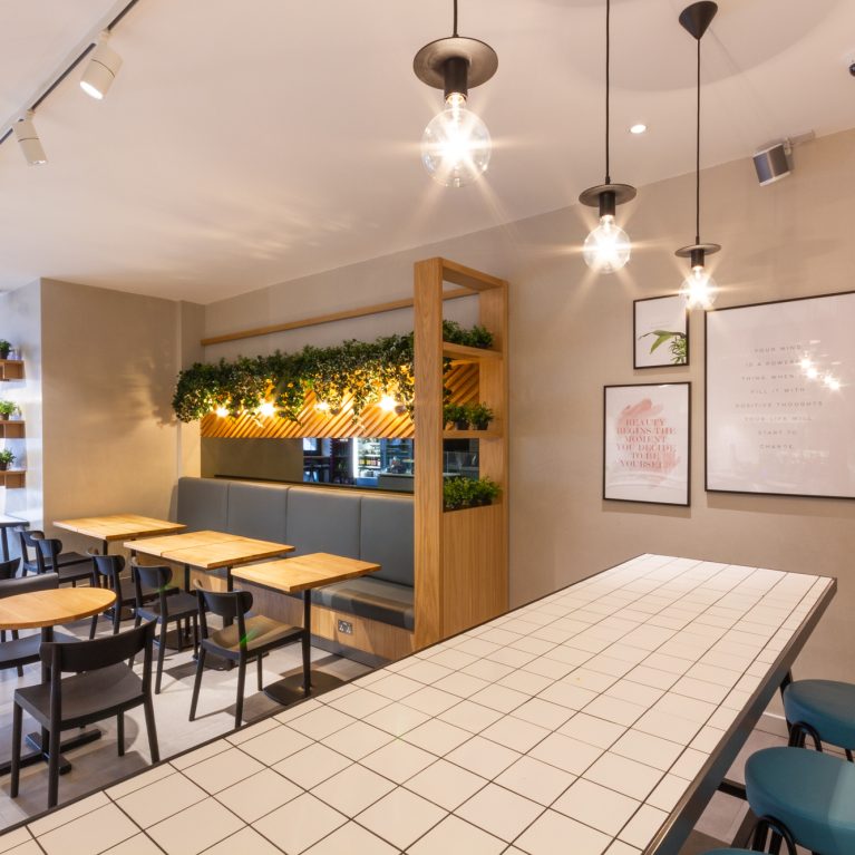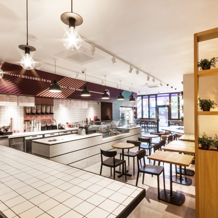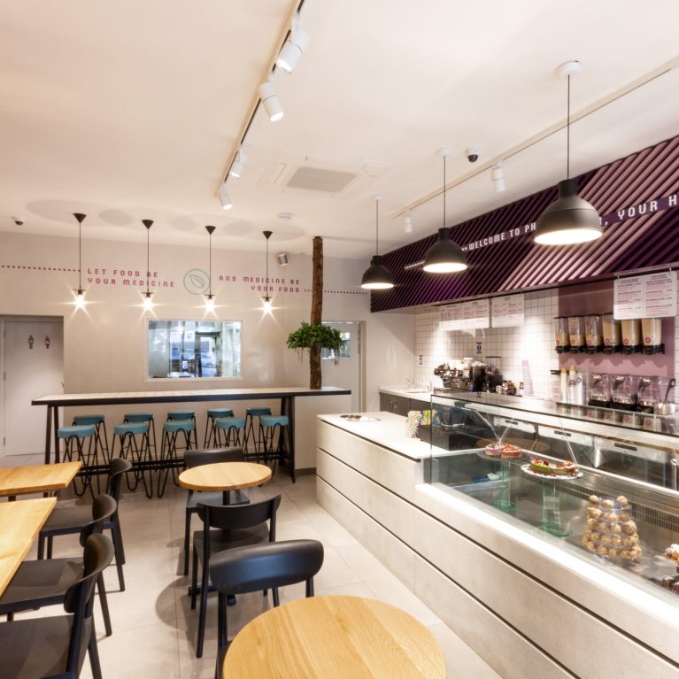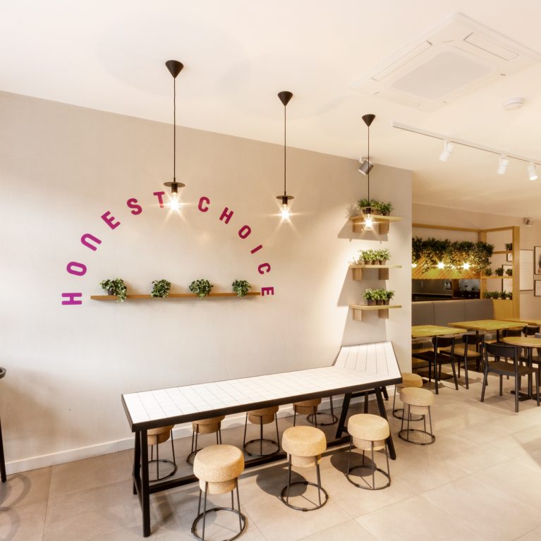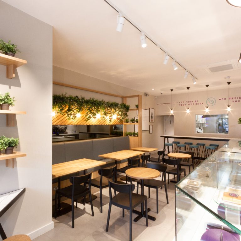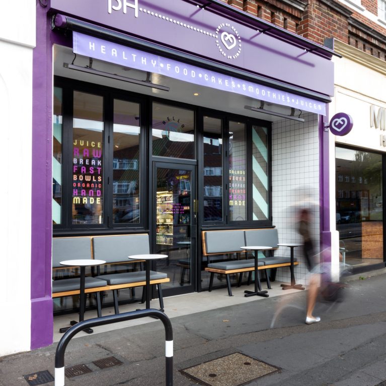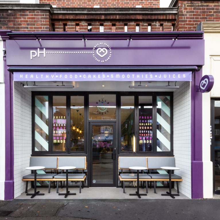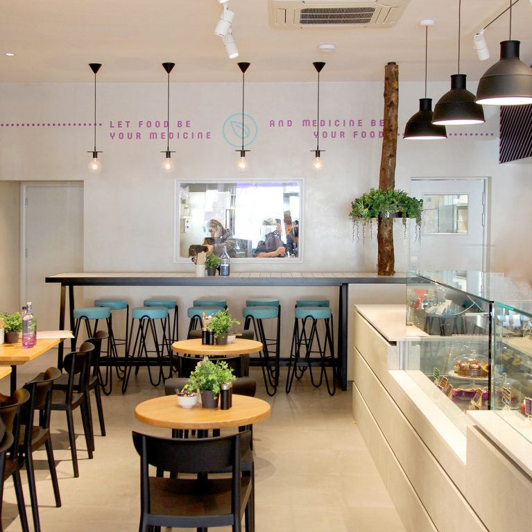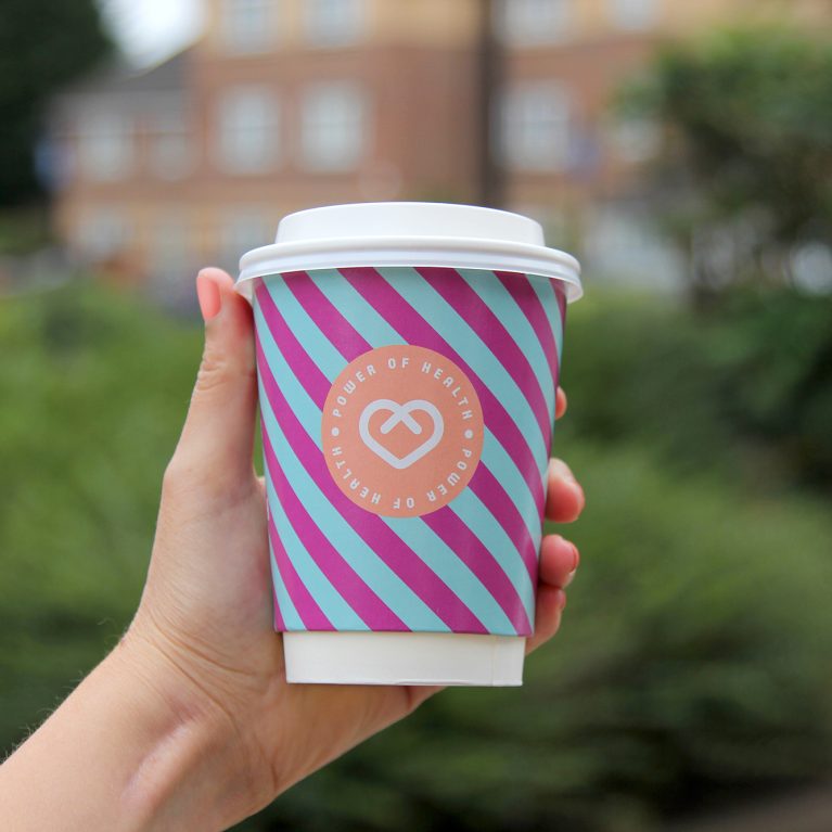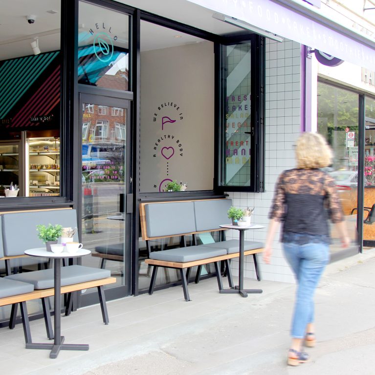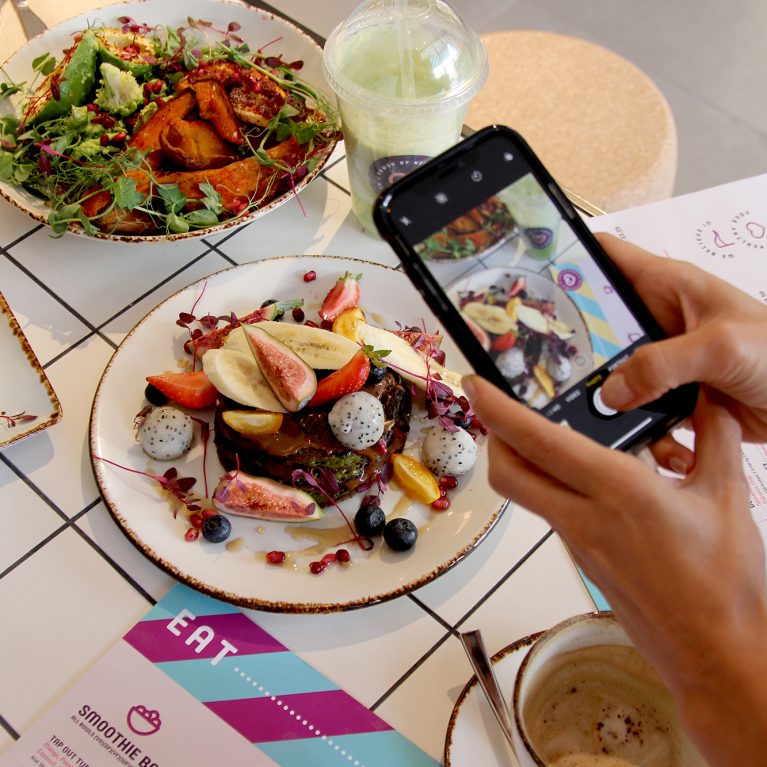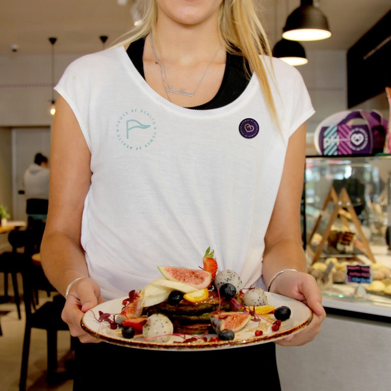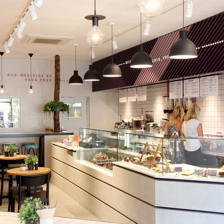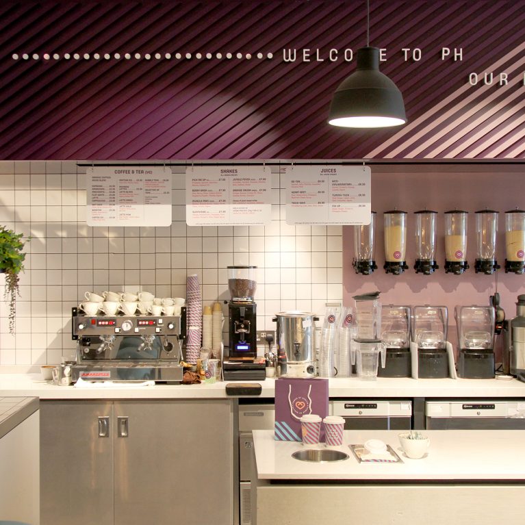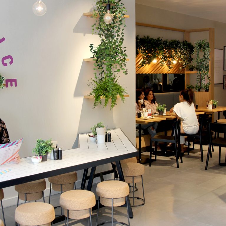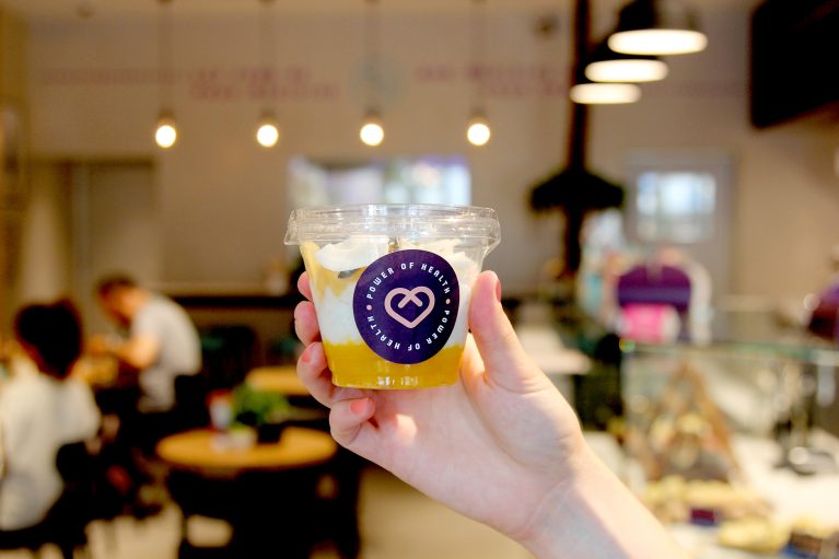
The grab-and-go packaging relies on full transparency to transform the fresh food into an active layer of merchandising. By showcasing the natural ingredients inside, the product helps communicate the healthy wellness message. This layout coordinates the retail inventory directly with the bright, modern finishes of the cafe interior.
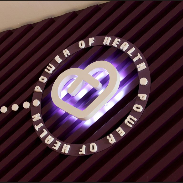
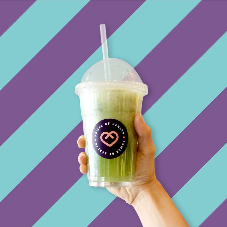
The clear, recyclable plastic cup shows the distinct, colorful layers of the healthy snack, matching the clean lines of the front food display counter. Centered on the front, a deep purple circular sticker features the white heart brand graphic and clean typography. The dark label contrasts sharply with the colorful food layers, making the brand easily recognizable to customers.
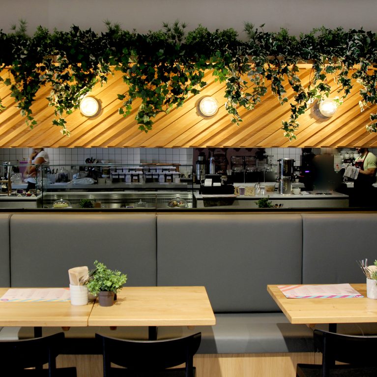
In the soft-focused background, the warm lighting from the hanging globe pendants and the neutral wall finishes frame the main dining room. Keeping the packaging simple ensures that it looks cohesive when placed on the white tiled tables or inside the commercial display fridges. This thoughtful alignment of product display, material palette, and clear labeling supports a high-efficiency retail operation.