The Briny
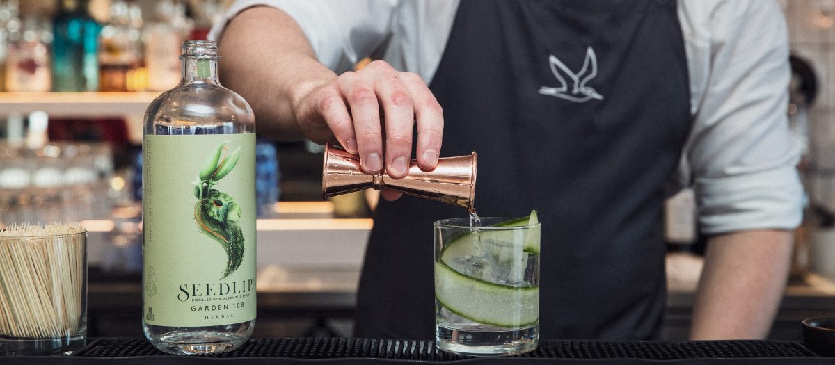
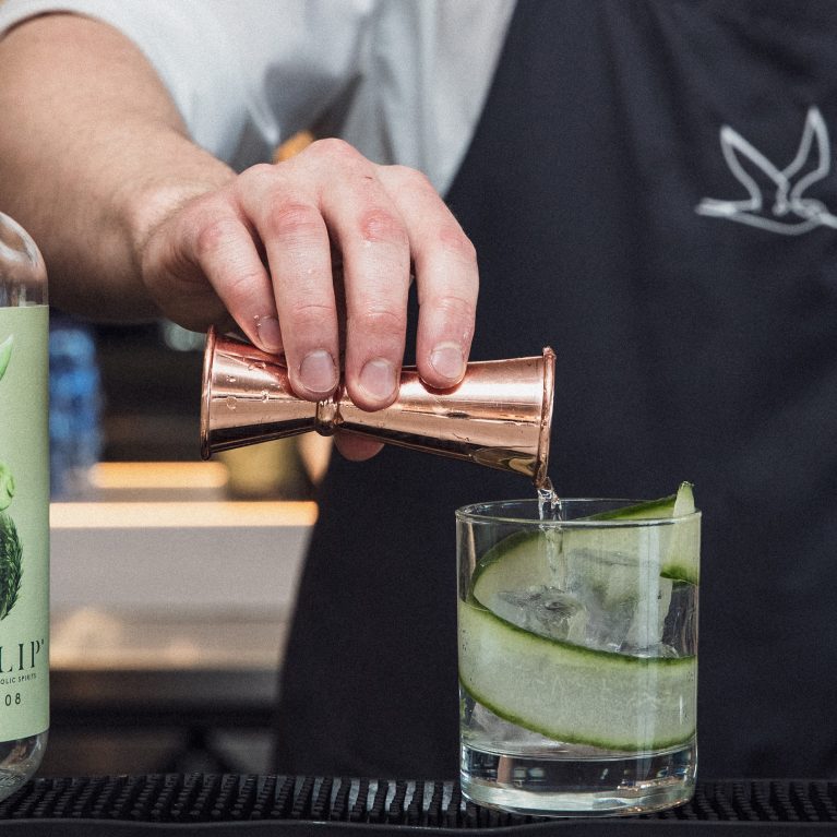
The bar concept highlights a refined, artisanal approach to service that complements the relaxed seaside interior. Tactile metallic tools and clean glass geometry are used to elevate the presentation of premium botanical ingredients, establishing a sophisticated yet unpretentious interaction point between staff and guests.
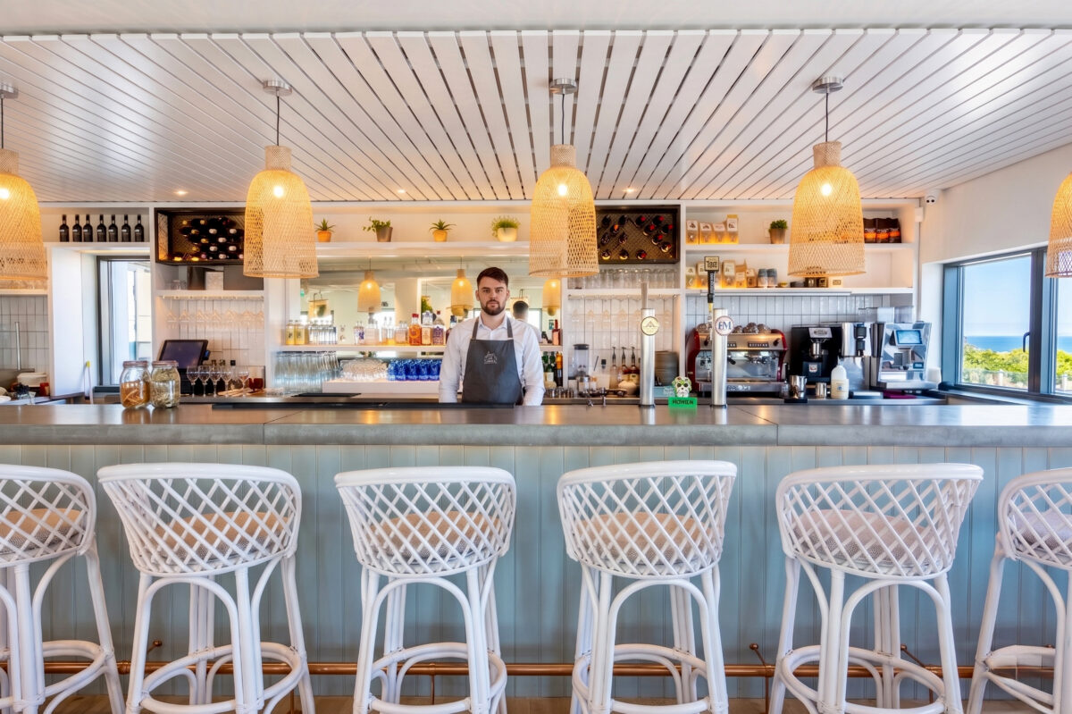
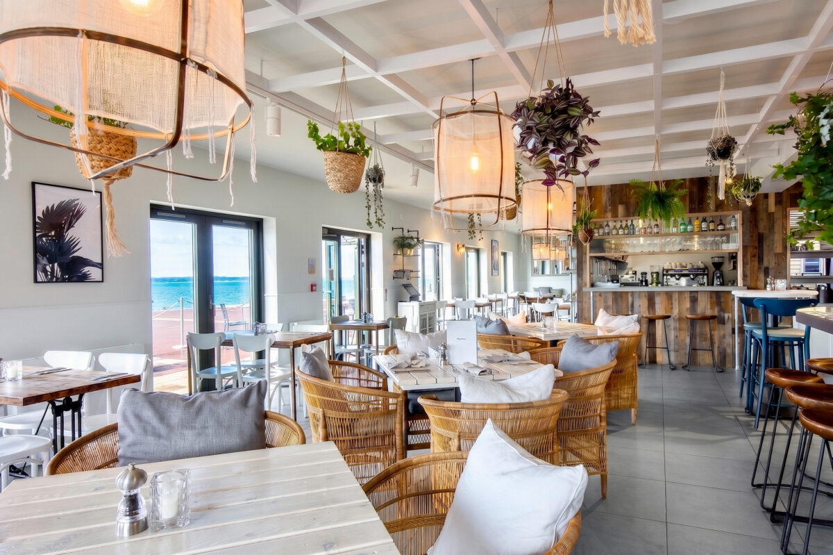
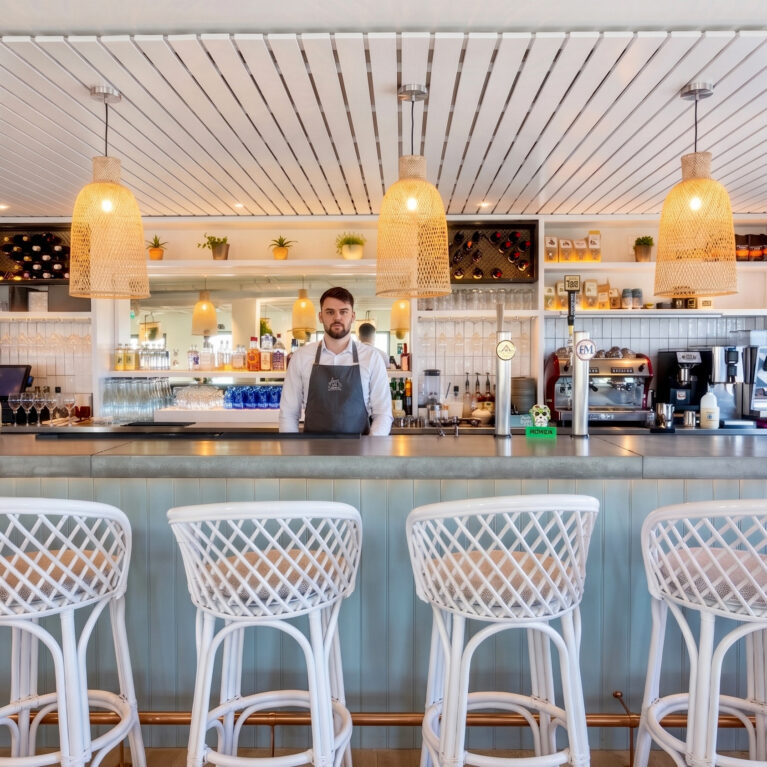
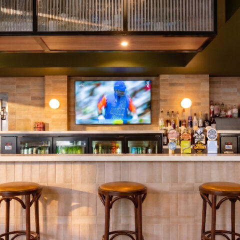
The main bar serves as the primary visual anchor inside the venue, utilizing low-profile horizontal planes to keep sights open to the sea. The layout balances cool, cast-stone work surfaces with warm, woven organic textures, referencing traditional coastal structures while providing a durable, high-traffic service zone.
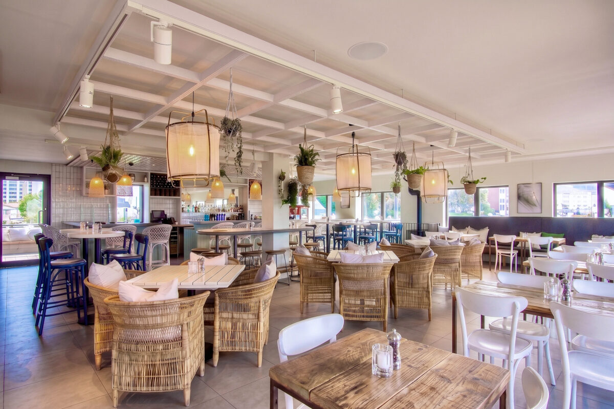
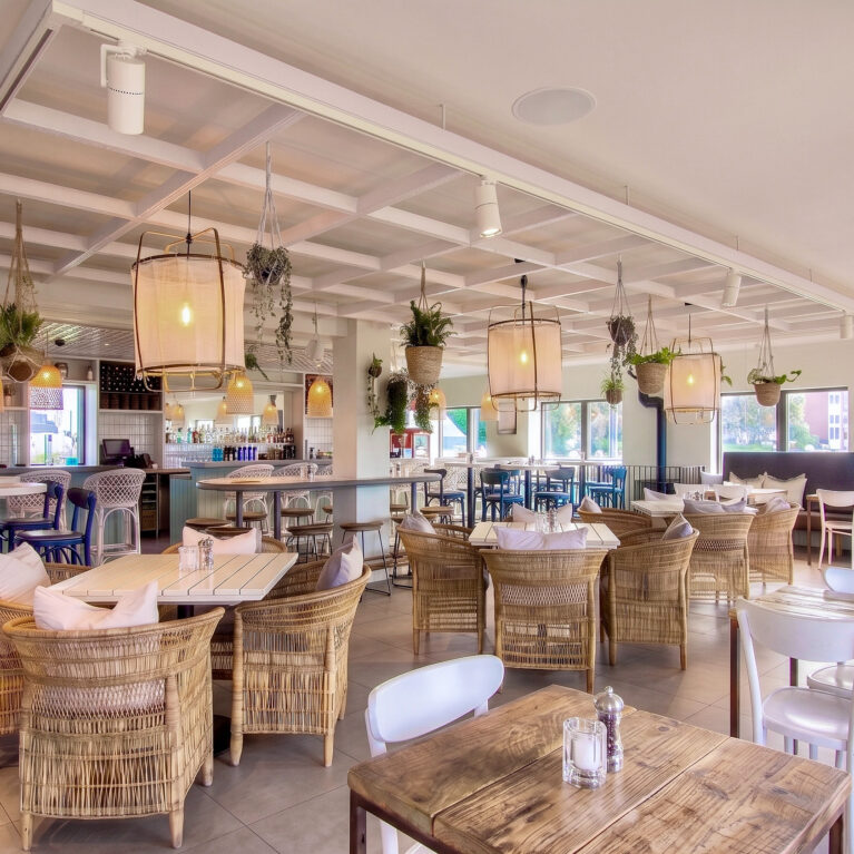
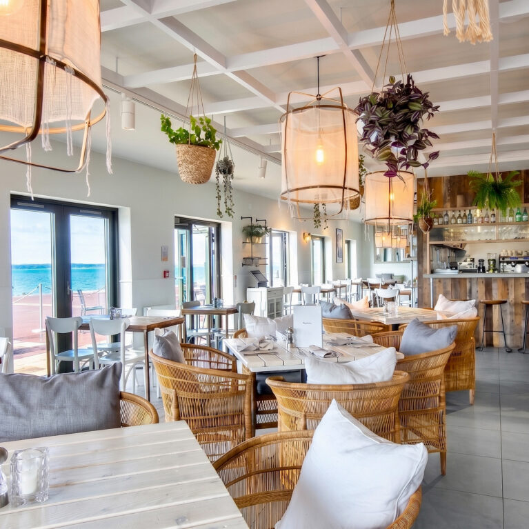
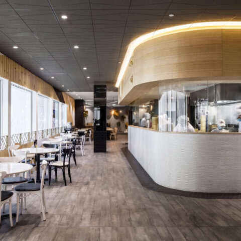
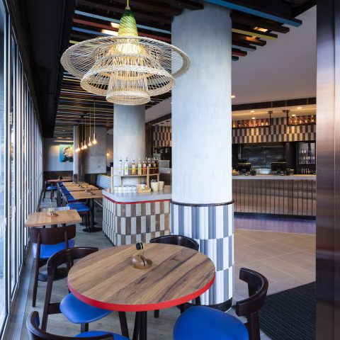
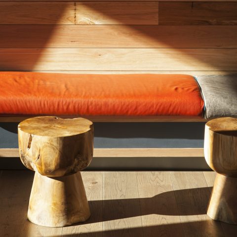
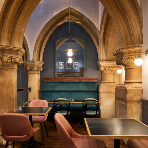
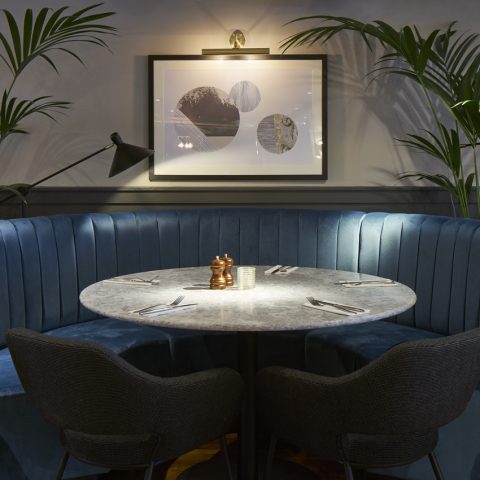
The dining floor employs a flexible, open layout to maximize natural light and maintain clear pathways toward the beach windows. A neutral architectural shell is paired with distinct furniture clusters—ranging from casual high-tops to comfortable wicker lounge seating—creating subtle functional zones without the need for solid partition walls.
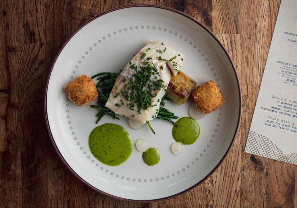
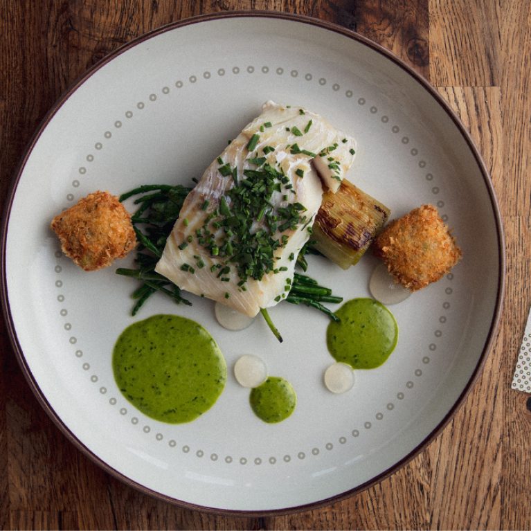
The presentation details bridge the gap between interior design and the final culinary experience. By serving seafood on textured, organic ceramics over heavily grained wood, the design concept reinforces a raw, honest approach to hospitality where the product matches the unpretentious character of the physical environment.
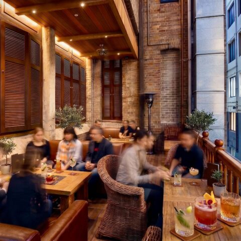
The architecture leverages the prime beachfront location by aligning the open-plan dining space with expansive glass doors. The layout maximizes the natural daylight reflecting off the water, combining light-washed timber surfaces with oversized fabric lanterns to maintain a continuous, breezy connection to the coastal horizon outside.

The culinary experience focuses on an honest, ingredient-led approach that directly mirrors the raw materiality of the interior architecture. By capturing the precise, hands-on prep work behind the scenes, the design story reinforces a commitment to authentic coastal hospitality, where the fresh product acts as the core driver of the brand's identity.
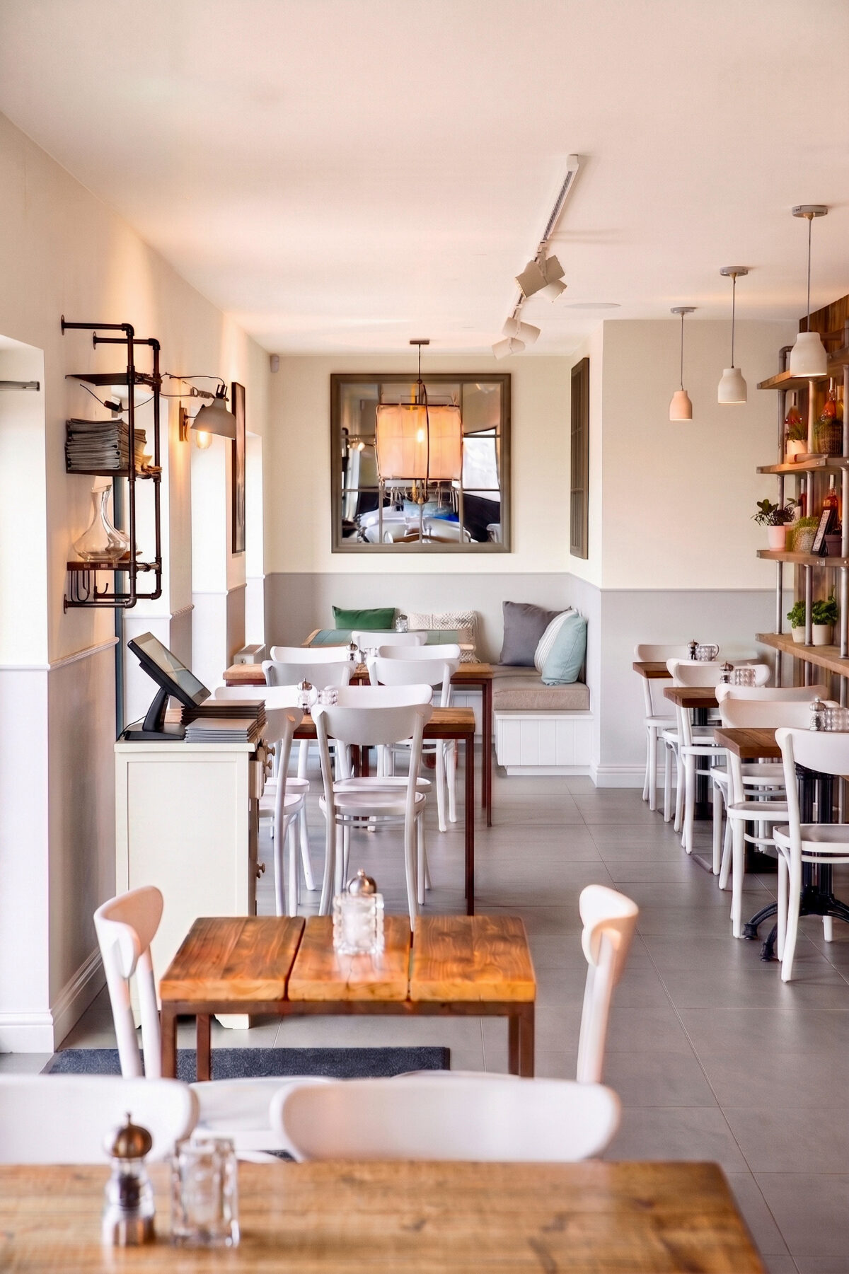
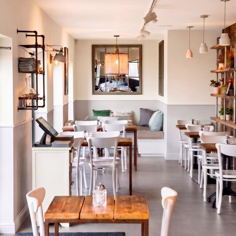
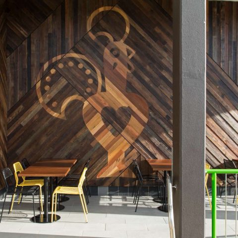
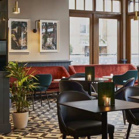
The narrow floor plan uses a central avenue layout to maximize seating capacity while maintaining clear operational circulation. A muted grey and off-white color palette washes the walls, allowing the raw grain of the wood tables and curated textural features to guide the eye toward the rear of the space.
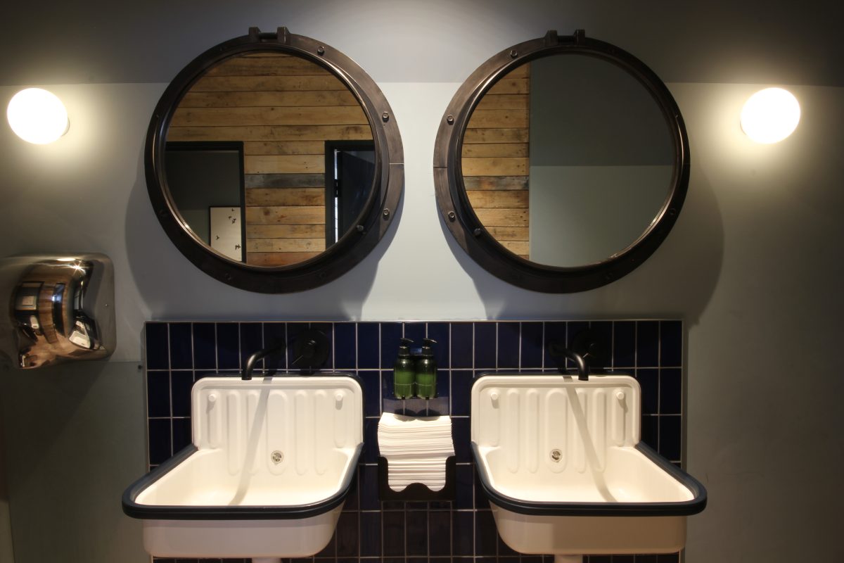
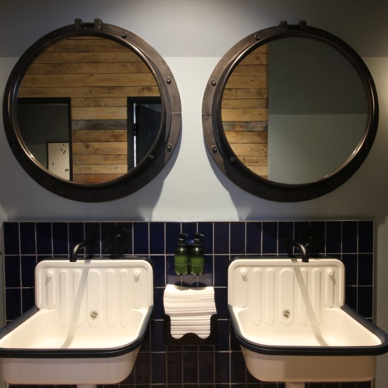
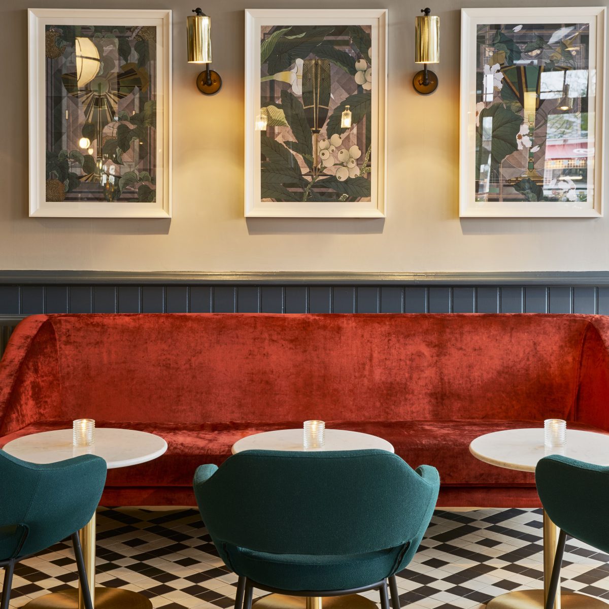
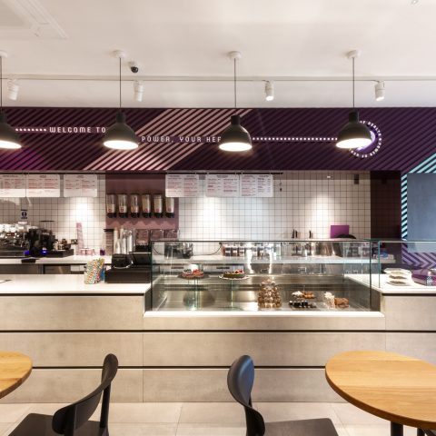
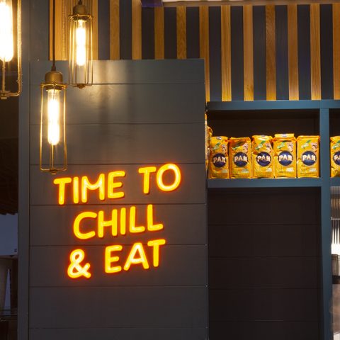
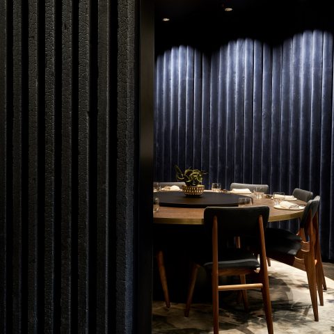
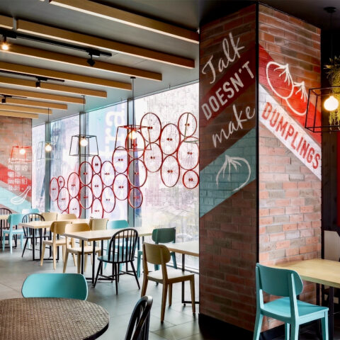
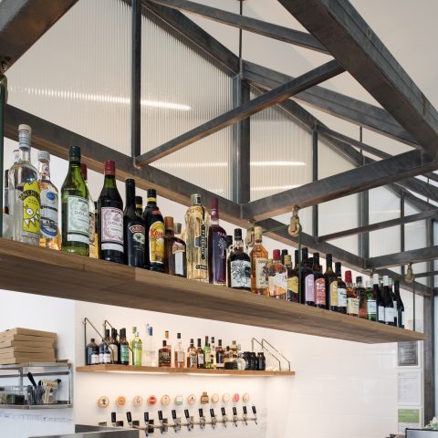
The ancillary spaces extend the coastal narrative using utilitarian, vintage-inspired fixtures that recall traditional maritime architecture. Heavy structural elements and industrial metalwork are combined with crisp ceramic surfaces, ensuring the brand identity remains consistent and highly tactile even within the most functional corners of the floor plan.
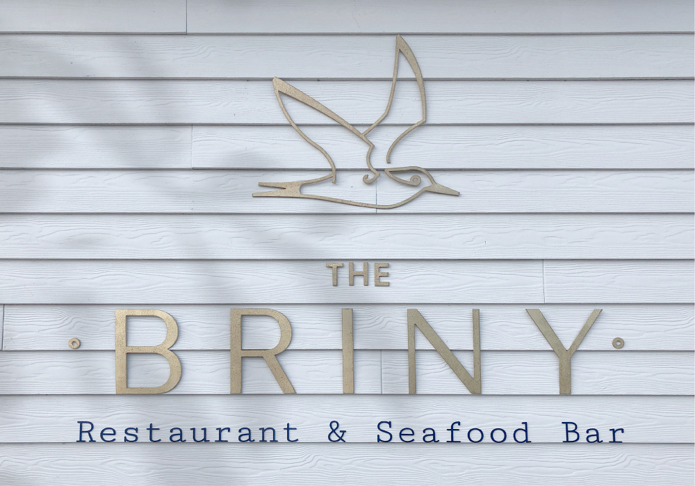
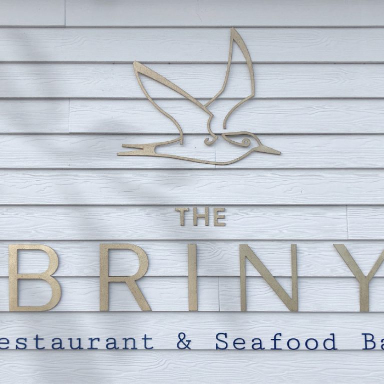
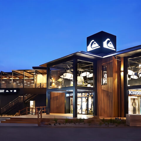
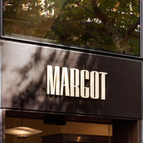
The exterior shopfront utilizes a clean, beach-house-inspired architectural envelope to establish an inviting street presence. Precision-cut metal branding elements are fixed directly to textured horizontal timber boarding, creating a layered, high-contrast fascia that catches natural sunlight and soft foliage shadows throughout the day.
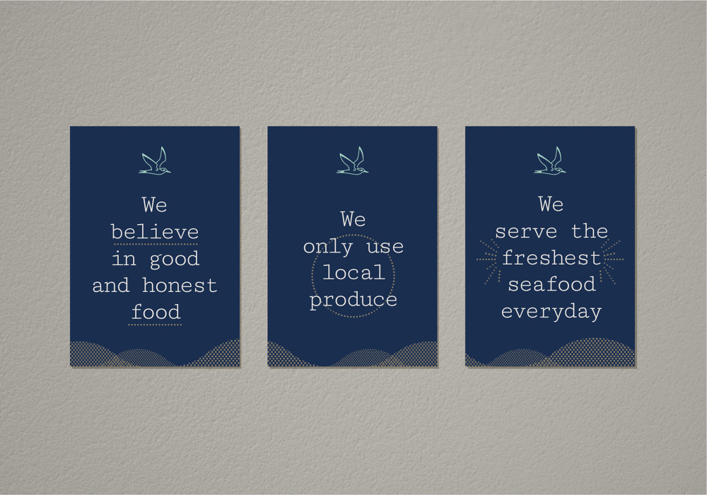
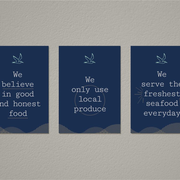
The brand collateral uses a clean, typographic triptych to communicate the venue's core operational values. By combining structured layout principles with organic wave illustrations, the print design reinforces the restaurant’s unpretentious, local seafood narrative across all physical customer touchpoints.
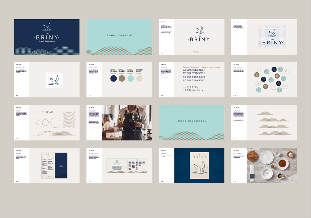
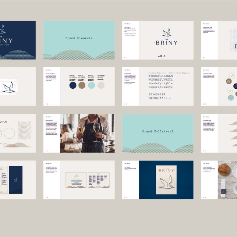
The brand guidelines establish a structured visual framework that coordinates all physical and digital touchpoints for the venue. This system defines the precise application of color palettes, typographic layouts, and linear icon variants, ensuring the relaxed, coastal-referenced aesthetic remains cohesive across uniforms, menus, and environmental graphics.
Project Gallery

The creative process

Brand strategy
Behind every successful brand is a clear, well-defined strategy. At Design Clarity, we help you uncover your purpose, values, and positioning—crafting a strategic framework that drives all creative and business decisions. Through workshops, market analysis, and stakeholder engagement, we distil complex ideas into a simple, actionable roadmap. This clarity allows your brand to communicate consistently, […]
Learn more
Restaurants
Design Clarity offer innovative interior design solutions across the hospitality and leisure sectors.
Learn more
You may also like
London
The Ministry,
79-81 Borough Road,
London SE1 1DN, United Kingdom
44 20740 36132
Sydney
Level 3, 223 Liverpool St
Darlinghurst NSW 2010 Australia
61 29319 0933